Restaurant HTML Template review
The Menu
Maybe the most important part of each place's presence, the menu and what's within it make the people come back time after time wanting more. That's why the Restaurant HTML Template has a whole section dedicated to the essence of the place – the food it serves.
With the Menu blocks, you can achieve pretty much any presentation of your menu carefully crafting it just like you did while composing it in the first place. You can either have Each part of it having its own appealing background, corresponding to the section's content
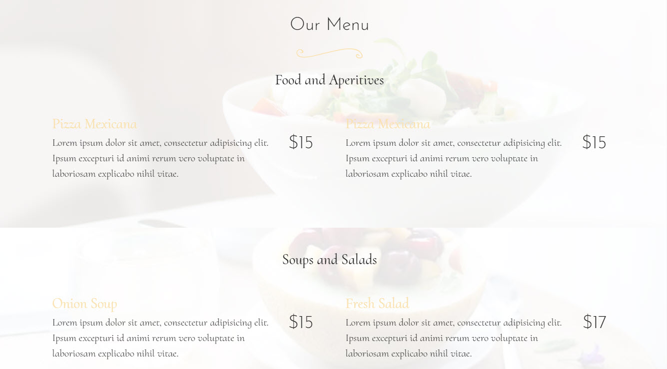
Easily selecting just how many items each section should contain by the convenient slider in the Properties panel, placing your ingredients and short description and even more – since any text in Mobirise Builder cab be turned into link leading somewhere – you can also link each meal to a place where you can say a few more words about it or –with using the great PayPal plugin the Mobirise Builder also has – let the visitors directly add it in the Cart and order it in case you've decided to also accept online orders
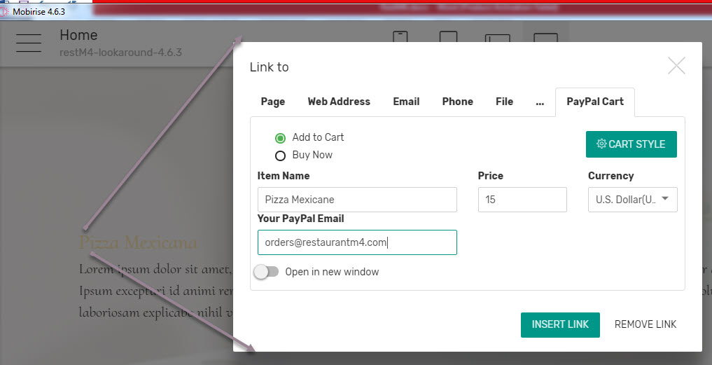
And probably the best thing about all this – it happens so easily and naturally – pretty much if you were typing the menu on your favorite text editing tool – without the time and nerves consuming process of figuring out what's doing what.
Extra tip: In order to structure your menu with the first menu block – use a few of them, placing the desired image as a background of each block, freely playing around with the title and subtitle options available to obtain better standing up. You can easily have a solid color background for some parts if you like to – just adjust select the one you need from the Properties panel and you're done.
But there is even more – in case you want
A single background all around and focus set on the features meals
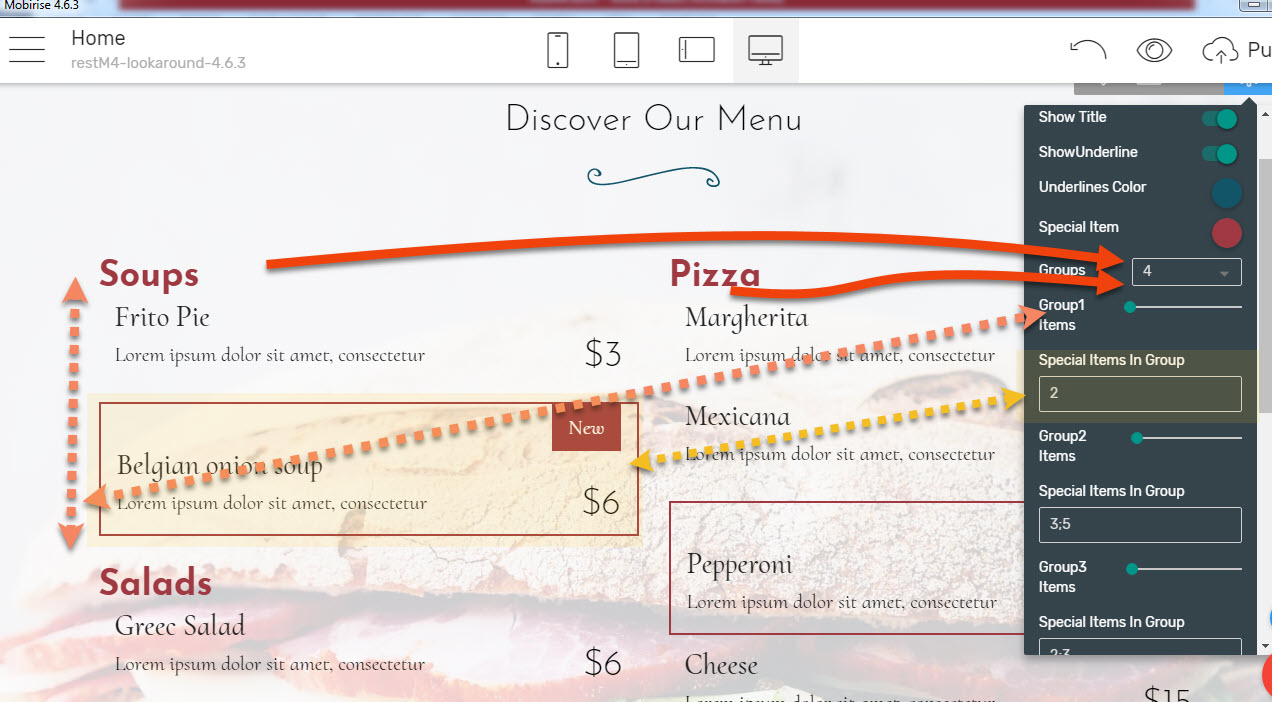
Many restaurants prefer having a single image behind the entire menu. In case these are your preferences as well that's really easy too – you just need to use the second block from the group. Ingeniously cooled up it allows you to add as many menu groups like Soups, Salads, Pizza etc. placing the needed number of meals inside them. And of course – since some are always more important than others – you can easily outline some adding a short description why people should pay attention to them like
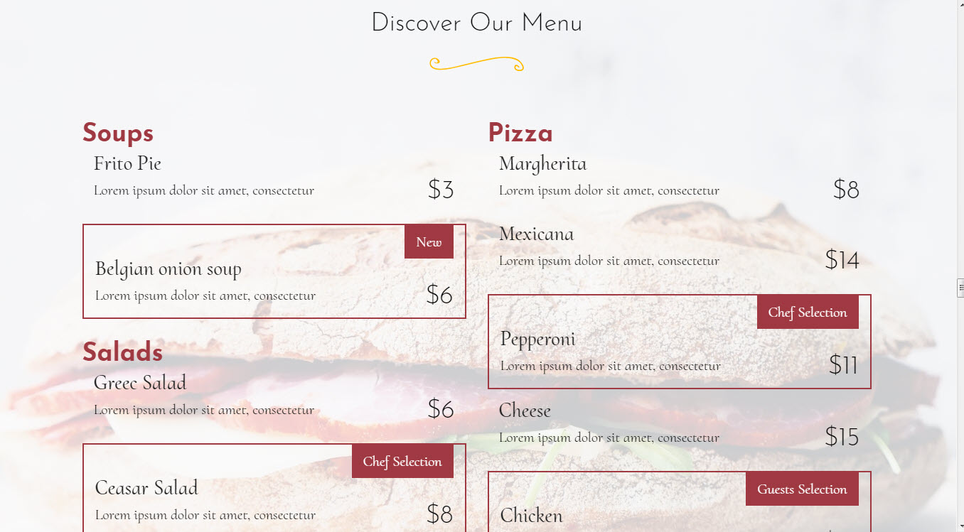
And of course – everything is capable of spicing up to your taste in order to fit the best suiting your taste presentation. Another advantage of this online menu element is you can always keep your menu updated without large investments of both money and time for design and printing. By putting just a few minutes at the end of the day you can have your unique menu ready for tomorrow.
Extra tip: Use the drop-down to select how many groups in menu you need (red solid arrows);
Adjust the number of items in each group with the slider (red dashed arrow)
If you want to outline an item, type its number in the Special Items in Group - like to make the second item in group special just type 2. If you want to make a few items special, separate the numbers with a semicolon ( ; ) without placing any spaces in between (the yellow dotted arrow and rectangles)
But that's far from all that there is, since you can also
Organize your menu in sections sharing the same screen
Which is pretty amazing – making one step further past the traditional list-like way people have got used to see the menus on the tables you can easily make different types of meals share the same screen so the choice is even easier. That way it gets a bit more interesting and interactive since the visitors have to select the proper section on their own clicking on the links on top actually interacting with the site just like they would be browsing through the sheets of an actual multipage menu on the table. Additionally – placing more items on the same screen spares scrolling around so it's not only more comfortable but also makes the page tidier and good looking.
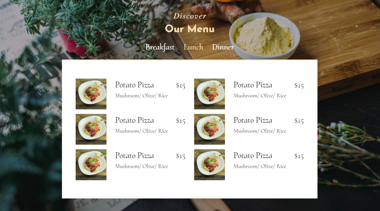
And to make it even better – this menu block comes with an image for every dish so it's even easier for you to impress and for the clients – to pick up.
So the menu blocks come to be your best friend in making your place's site work for you. However, they can actually help you beyond that since you can as easily
Use it as your design studio
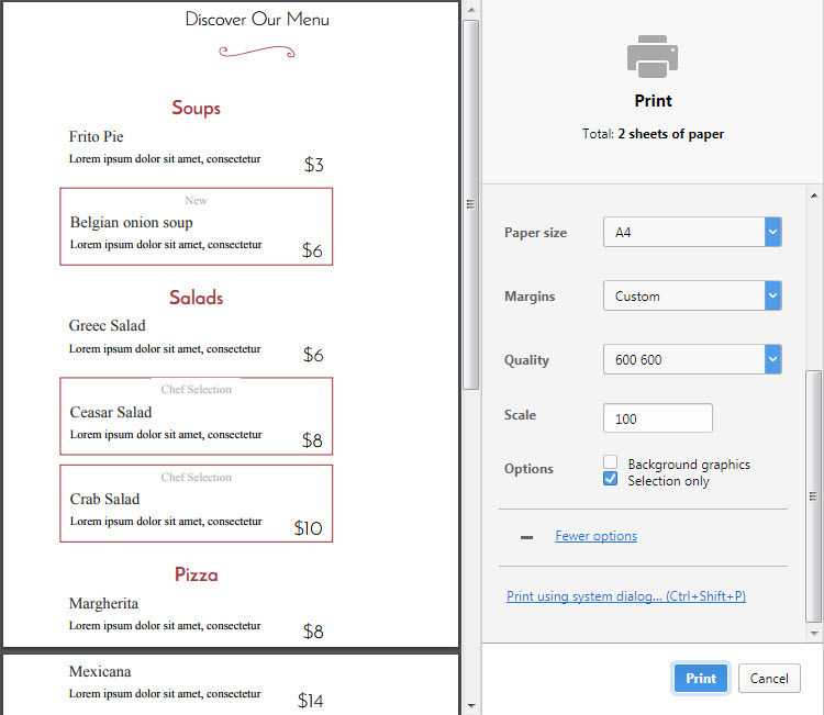
And make your life even easier since once you have figured out and carefully created the way menu would be looking like for tomorrow on the site – what could possibly stop you printing a few copies of the Menu Page of your site and spreading them over the actual tables?
You have easily designed it yourself already!
This way you not only get a great presence of your place on the web but also achieve consistent appearance and pretty looking updated menus both – on site and on the table. And it's so easy!
Now that we have covered the menu and the people have already made their choice it's time for them to
Reserve a table and come visiting
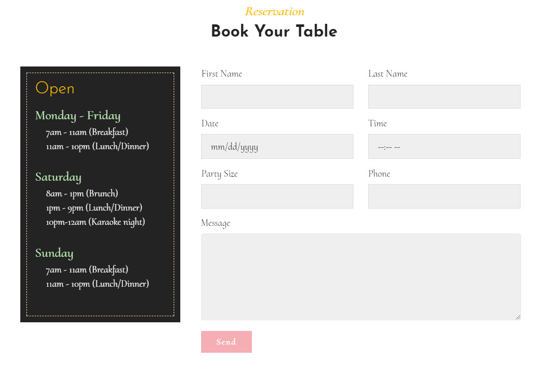
That's why the Restaurant Responsive Theme has even more reservation forms like the one we already saw in the Header blocks helping you either get the interested visitors also aware of your working hours while biking their table – all on the same screen so fewer tables are booked in the res hours by mistake (and it also looks good)
Or in case you would want to be more expressive and let the images speak for themselves you can decide to do it like this:
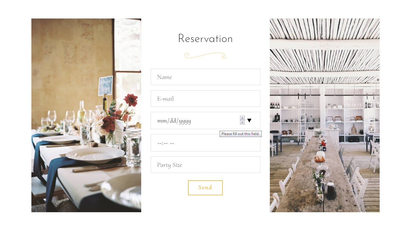
Either way, the reservation form setup takes only a minute picking up the fields you need and once your email passes once over the quick form sender's service verification procedure you're all set to go – you will receive even the test reservations you decide to make while still previewing the site on your own computer! And of course, no restaurant site is complete enough without a map guiding the people to it. That's why the Restaurant Responsive Theme has a convenient map block as well. Due to the intelligent way it has been designed all you need for properly setting it up is typing your address in
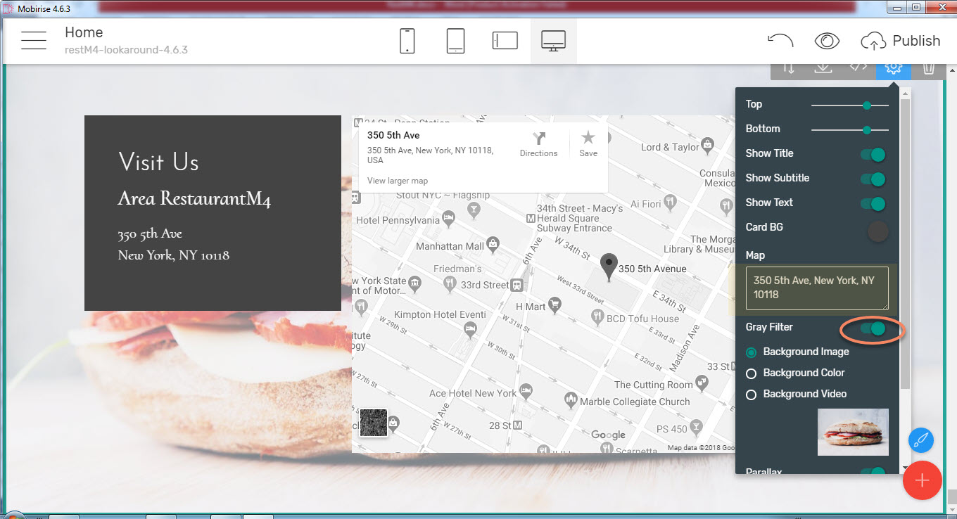
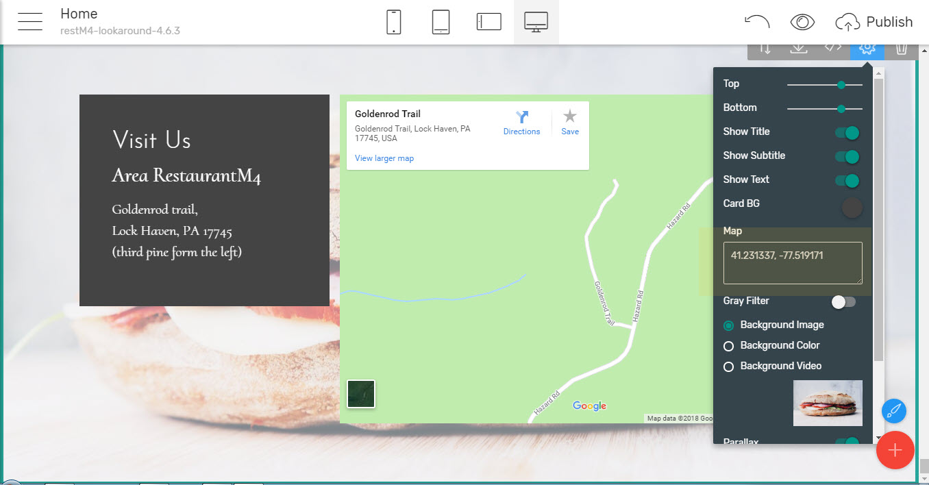
And since the Google map's colors might not always fit the ones you might have selected there is also a cool grayscale filter as well making the map blend nicely practically anywhere. Now if you're situated in the City that would be quite enough, but how about if there isn't a specific street/number address associated with your location? It's really easy – just past your place's coordinates instead and the map will flawlessly find it!
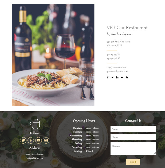
Of course not anyone is fan of maps so in case you prefer it another way – you can as easily use a traditional info blocks just holding whatever info you think is most appropriate for the people to find you or place all the contact info in one of the cool customizable footers – the choice is entirely up to you
But just before they decide to come to see for themselves the people might also wonder
What the others are saying about you
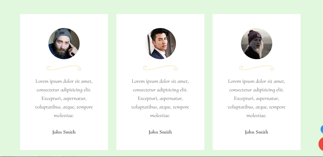
So to stun them with all the amazing feedback you have already got from happy customers all you need to do is use the Testimonials blocks selecting form placing many good reviews on a single screen when they are rather a few sentences in size
Or use the Client quotes slider in case there is a bit more to read
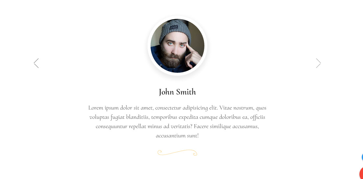
And of course – don't forget placing the names and faces behind these words so it's clearly seen these are real people and not just cozy words you thought on your own. This final drop might be the one making your site's visitors entirely confident that your place is to be the very next to visit.
So once all the main ingredients have already been put in the pan it's time to
Add some more flavor
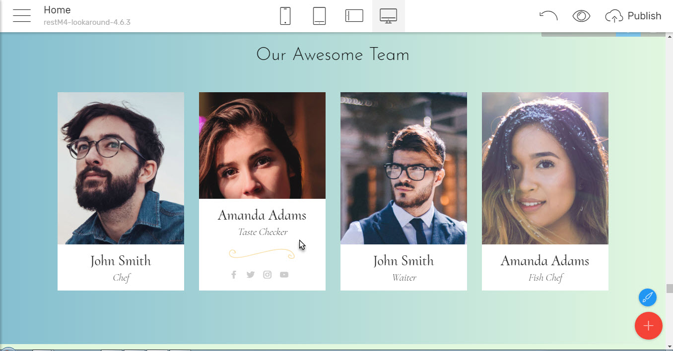
By introducing the team working hard making it possible you can create a stronger bond with your present and potential clients showing there are real human beings behind the counters and of course it's always interesting after the pleasant night out to check the place out getting to know a bit more about the people making the magic happen
Another way to add some flavor is using the great Gallery and Slider blocks which can, for example, help you easily create a showcase of meals or views from your great place which you can even order by tag in the Gallery
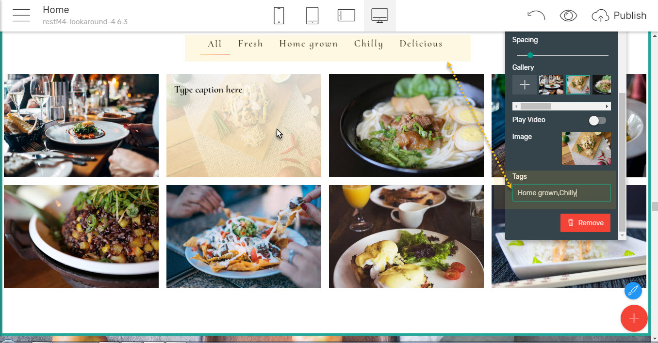
You can add a short description over each image in the gallery and also have it tagged by one or a few tags so the people could easily sort the gallery checking out only what grabs their interest.
Extra tip - Make sure you write the tags exactly the same way for each image. A tag name can have spaces but if you want to separate two tags – use just a comma (,) and no spaces around.
Another way adding some flavor to your great new site could be
Sharing some thoughts and stories
And maybe in time, your place will become to be "This restaurant from the blog" in case you accidentally discover you also love to write about food (or whatever). If this comes to be your case – the Restaurant HTML Template comes fully packed with everything you will ever need telling your story. Along with all the cool blocks we talked about there are some especially dedicated to articles and storytelling – like clean beautiful paragraphs, headings and quotes, Images and videos filling up the entire screen, cool lists and icons
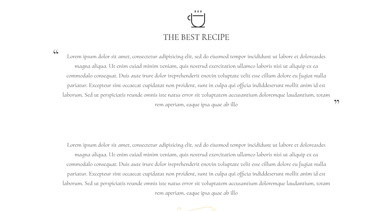
So now nothing stops you from revealing the secret of your great recipes on the web.
Now there is how lightly, with a smile and inspiration you can easily cook the website for the great restaurant you're running on your own with Restaurant Responsive Theme and Mobirise Mobile Web Builder. Just follow your heart and the concept you have already created in real life and it will be a guaranteed masterpiece at the bottom line.
This however still isn't all – so here is a
Bonus round – changing the recipe once the dish is on the table
You can’t do it in cooking but guess what – with Mobirise Builder created websites you actually can alter significantly the spicing of the site once you have already placed all the blocks and poured all the content in. Actually – you can do this at any time you like with the ingeniously thought Site Styles panel which allows you changing the entire website color scheme, the fonts used for the different types of text in the site all at once by just a few simple clicks. You can always experiment different appearances from there, changing colors and switching any font used with any other from the Google Fonts library without even leaving the Styles Panel at all.
Actually – in case the initially set color scheme isn't exactly yours, it might be a good idea starting your quest from the Styles panel and ending it there again to for eventual fine tuning after working on the site for a while has shown you if there is something to make even better or not.
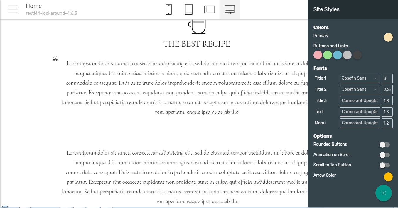
Extra tip - To make the choice of fonts even easier – experiment with some different fonts on the Google Fonts website, then when you have settled for a few – just use the fonts search box in Mobirise Buider to easily locate and add them to your site.
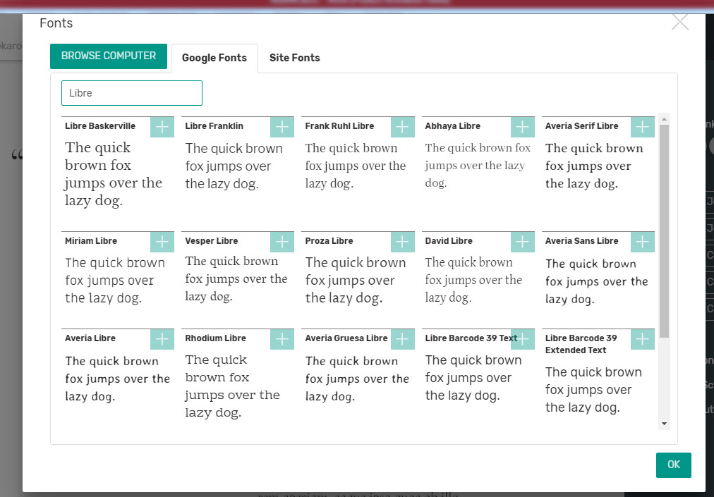
You even can add some fonts form your computer if you like to or use the Styles Panel to turn on some extra features like animating the content entrance on screen or either to have a scroll to top button or not and what color, so take some time to play around with it – might be the final touch of your site's presentation hiding in these switches.
So I guess that's pretty much how our restaurant website got
Ready for serving
Since at the end of our quest through the Restaurant HTML Template for the Mobirise Mobile Web Builder it became quite certain that using this great pair any Chef, restaurant owner or just a regular food lover can easily cook a restaurant website and not just any kind but amazingly beautiful one, created with the cutting edge technology in web design and displaying beautifully on any device. All you need is a computer, a decent camera or phone, your great concept and a pinch of inspiration.
And don't be afraid to experiment, guys – in web design as in cooking one should always follow the heart.
Happy web site cooking!
