30+ Fresh HTML jQuery Image Sliders and Carousels of 2021
Responsive jQuery Bootstrap Carousel
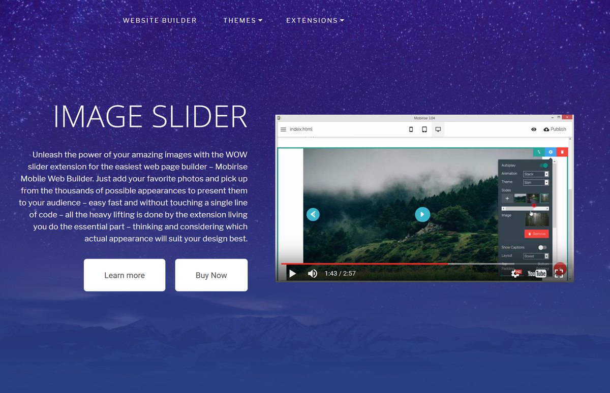
Create a mobile, retina, touch-swipe carousel that looks amazing on all browsers and phones. Add images, text, videos, thumbnails, buttons to slides, set autoplay, full-screen, full-width or boxed layout. Comes with easy drag-n-drop builder - make a slider w/o coding!
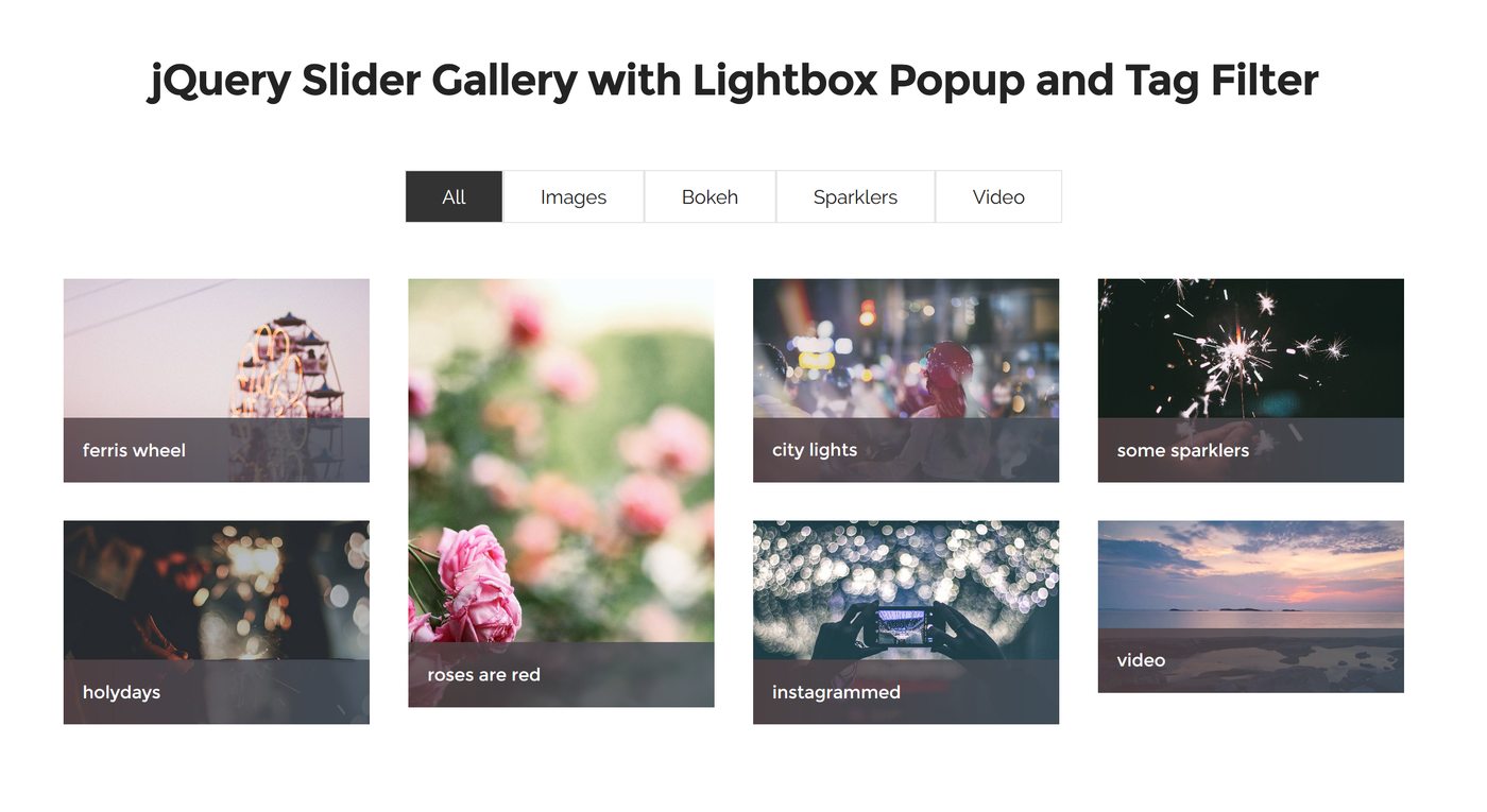
Responsive Slideshow with Lightbox Popup and Tag Filter
This Bootstrap slideshow template is clean, modern and simple — ideal for a website with a minimalist theme, or one that wants to show off a modern design ethos. The slideshow images are large, which makes this template ideal for image-focused websites, such as photography portfolios or e-commerce websites.
Each slideshow image ‘drops’ into place vertically, with a little bounce at the end which makes the movement feel very organic and natural. The time each image stays on screen is brief, but this can, of course, be adjusted in included builder. You can use both pictures and videos for your responsive gallery. Moreover, you can use gifs and svg in it, and your site visitors will be able to view them in a lightbox modal carousel.
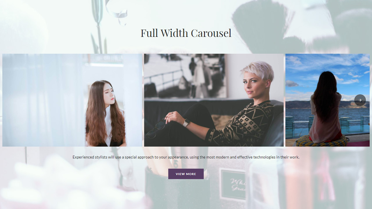
Beauty AMP Page Gallery JS Template
Light AMP Responsive Carousel Template
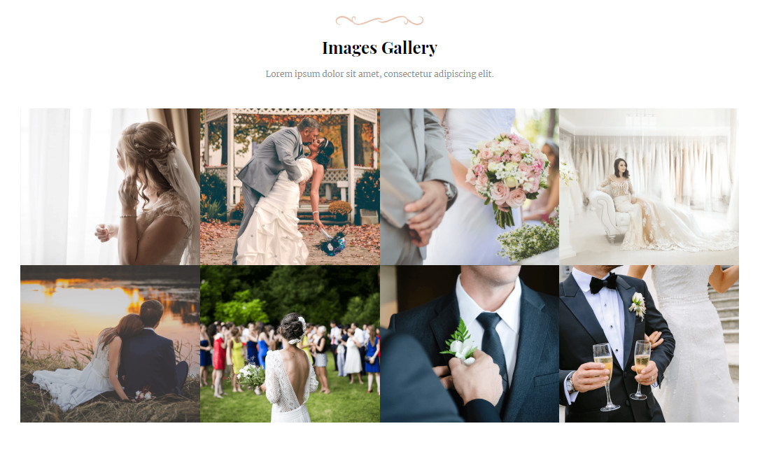
Wedding AMP Responsive Gallery
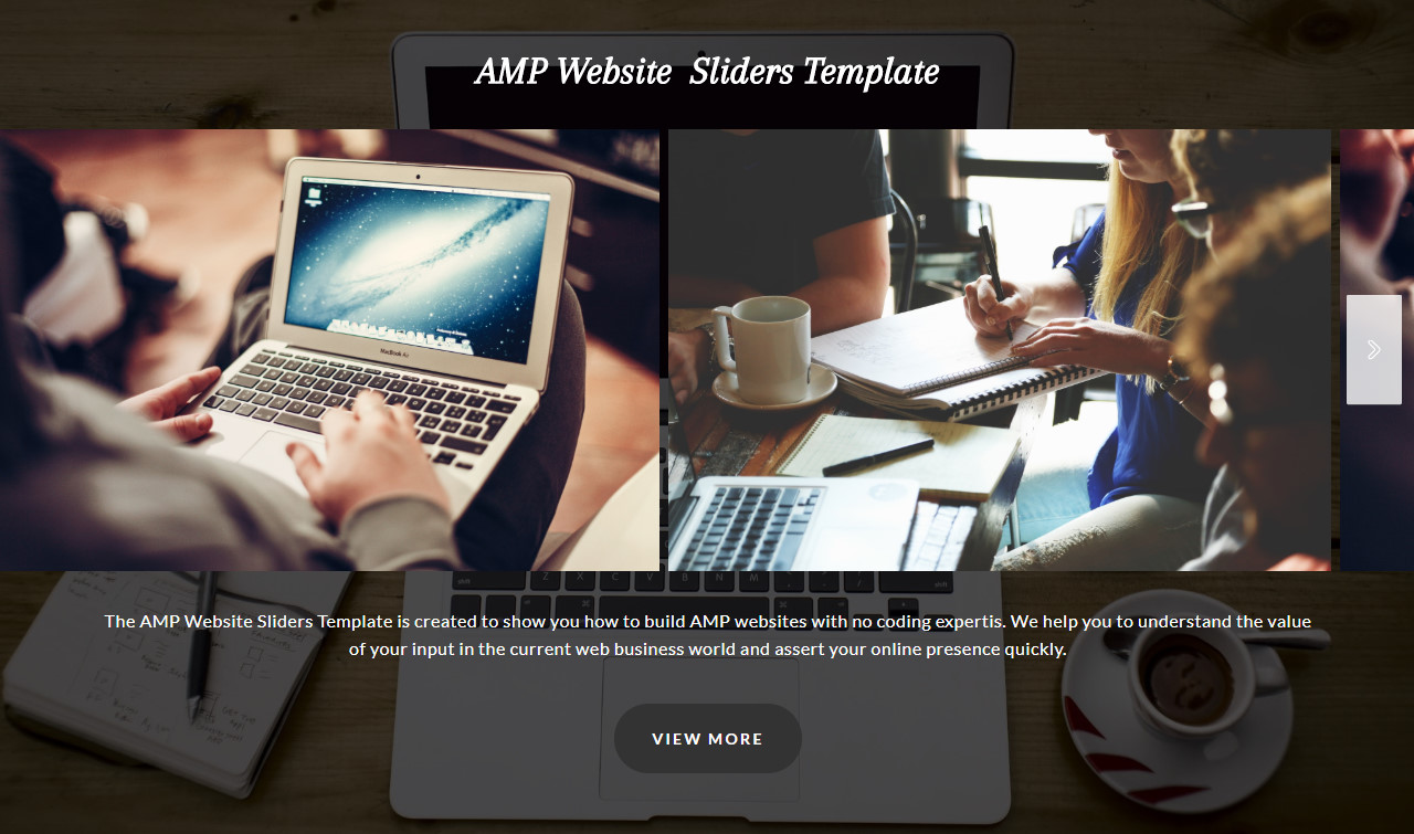
Business AMP CSS Carousel Example
Architect AMP Mobile Image Gallery Template
Sound AMP Website Gallery Template
Beauty AMP Image Gallery CSS Template
Space AMP Web Page Gallery Sample
Fitness AMP Landing Page Slider Template
Startup AMP Carousel HTML Template
Event AMP CSS Site Slider Template
Grafito Gallery Plug-in - HTML5 Slider
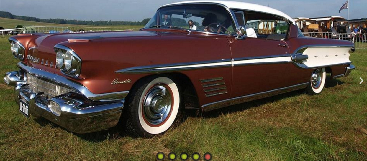
This gallery has a modern elegance and an unusual color scheme. The result is very unique and eye-catching!
There is no frame effect to the slides, allowing the pictures to take up the maximum amount of space. However, the images do have a 'rounded corner' effect, which makes them look like modern photographs of cars.
The font used is Averia Sans Libre, a unique font that was created from the average of many other fonts. It has a fun and slightly hand-drawn look to it, which complements the quirky modern feel of the gallery well.
Gentle Simple Slider - HTML5 Image Carousel
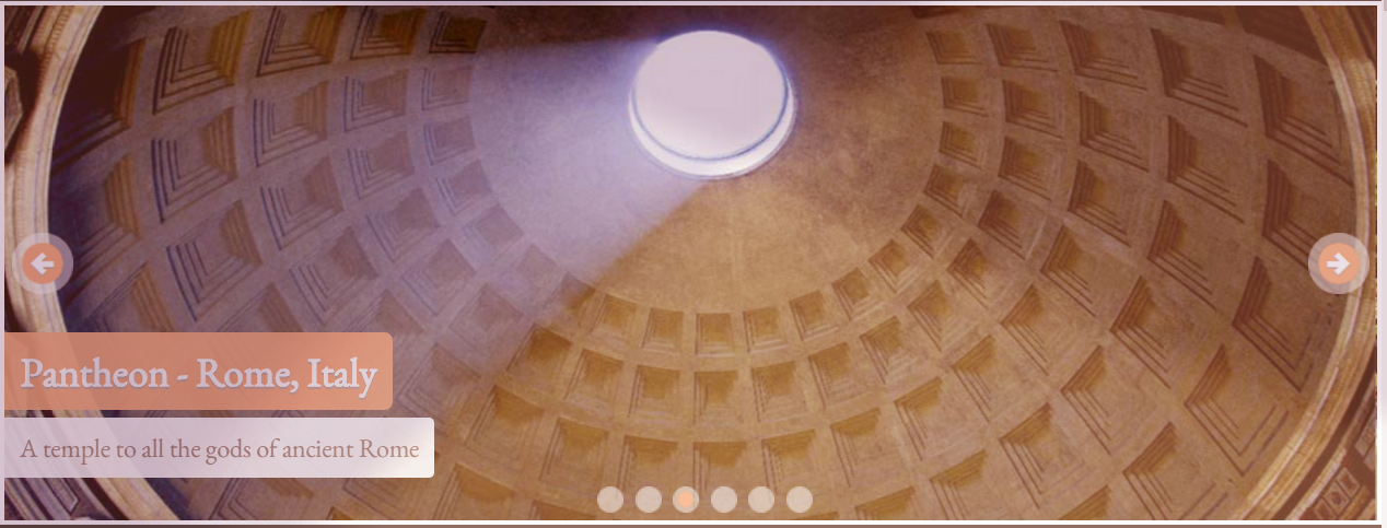
A picture carousel is an ideal accessory for just about any webpage and may provide it a polished and professional look. Even the most basic website design will appear brilliant with incorporating a graphic slide show.
The images show the historical architecture, so this slideshow can be used for any type of presentation to showcase ancient buildings.
The slider feels modern and enjoyable to implement. The application of bullets makes this clear the way the navigation system works, so this carousel is simple to grasp and apply.
Retina-friendly Slideshow - Mobile Image Carousel
This slider has a simple, clean and very modern design that uses black and white.
Hovering over the slider lets two navigational arrows appear, one on each side. The arrow consists of a white arrow head with a black semi-transparent circle outlined with a thin white border. Hovering over the arrow makes the arrow stand out more with its less transparency. Clicking on an arrow cycles you through the images. Because of this websites clean and modern design, this slider would work well on technology websites, software companies and websites about modern architecture. It would also be a great choice for science-fiction authors and any website about outer space or future thinking.
Turquoise Picture Slider - Bootstrap Image Slider
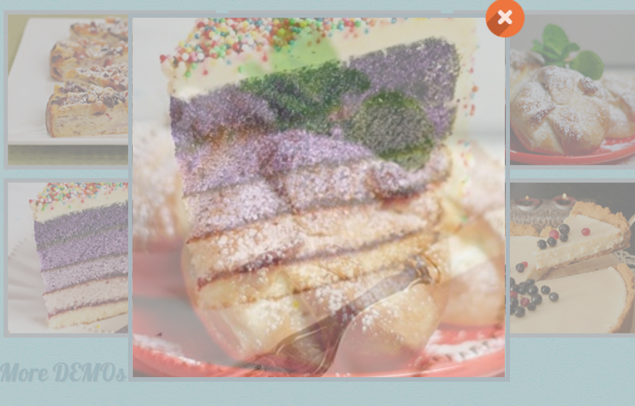
The turquoise template will wow your site visitors with its original elements. The arrows are plain circles with arrow signs inside that have shadows falling aside. The description font has an attractive shadow as well. That’s what makes this slideshow spatial to engage the visitors’ attention. Since images in the slideshow have different sizes, the transition effect lets them fluently turn into each other.
If you hover over the thumbnails, you’ll see a circle with a loop in it on the gray semi-transparent background.
This slideshow would be suitable in websites for restaurants, culinary events and other to inveigle target audience.
Parallax Image Gallery - Mobile Carousel
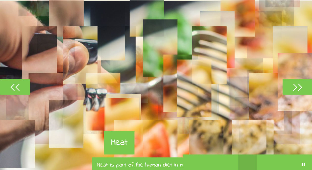
The current responsive image bootstrap gallery can make everyone pleasantly hungry. Looking at this slider, users will calm down due to this green-colored design. On left and right slide sides 2 arrow buttons are shown. They consist of a rectangle colored in green having a double arrow inside. The button shows a small preview image while hovering the mouse. The text description is located in the bottom-left slide corner. The font ‘Indie Flower’ is written in a green rectangle. You can effortlessly go to any slide by clicking on thumbnails.
Zippy Photo Gallery - Mobile Carousel
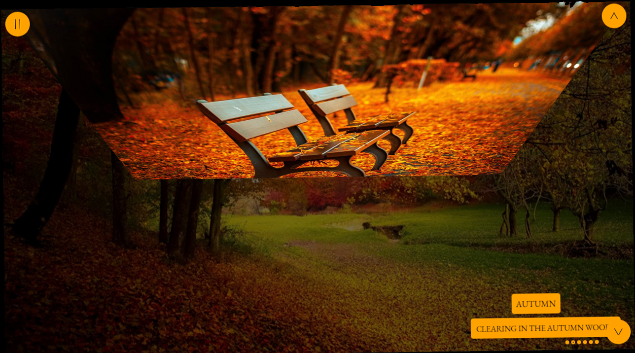
Zippy template is not like the others. The arrows are situated in the right top and bottom corners, both in one side. The arrow button is made of an orange circle and a thin black arrow. The description is also outstanding. It is built with a Garamond font. The description has no background so the writing looks modern.
On the lower part of the slider one can find stylish bullets - orange dots. The Turn effect has a strong impact on viewers gaining their attention.
Cursive Image Slider - jQuery Image Slideshow

This css-only carousel template is fun and playful whilst retaining a modern simplicity. It is fast to load, completely responsive, and does not require javascript or JQuery to work.
The design uses cursive fonts and a ‘sketchy’ design aesthetic that helps the slideshow look handmade. However, only a single color is used, making this design ideal for websites aimed at creative grown-ups, such as cooking blogs, scrap-booking websites and other ‘Mommy bloggers’.
Because the slideshow uses only css to create the interface and transition effects the slider is extremely fast to load and will work on any device with a modern browser. Use this beautiful slider to showcase your recipes, handmade arts-and-crafts, or crafty supplies.
Ionosphere Style Gallery - Responsive Image Slideshow
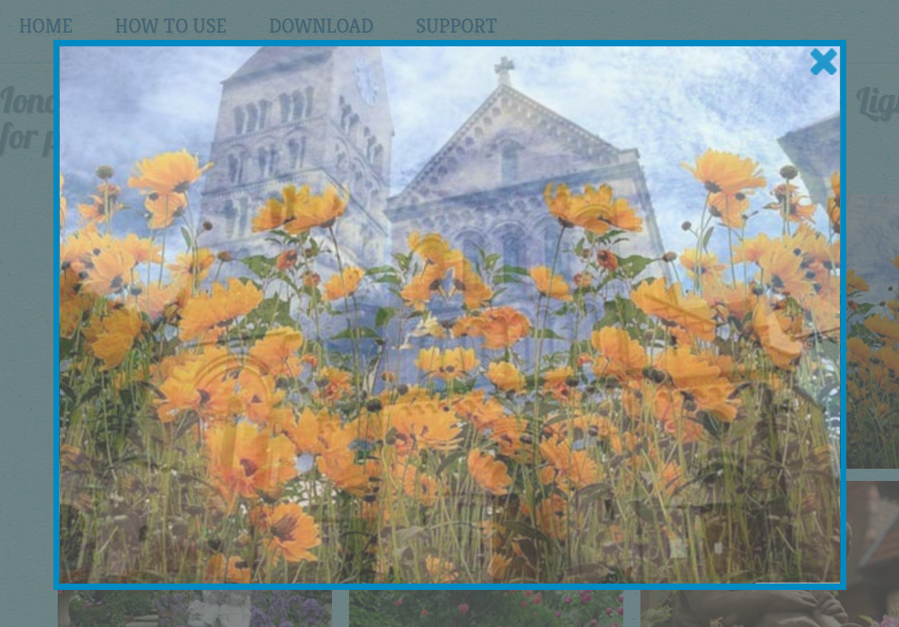
Everybody would be impressed opening this reach and colorful slideshow where we can see french flowers and old-fashioned houses. Adding this slider will guarantee that viewers won’t be able to keep their eyes off of your website.
The pleasant lightbox has rounded edges giving your site the most romantic look. Hovering over the popped up images let blue navigational arrows show up to go for and backwards through the slider.
At the picture bottom you’ll see the slide description with black background that appears from underneath. The whole design perfectly fits the concept of this presentation, so it can be applied to make your website look more beautiful.
Route Content Slideshow - CSS Image Carousel
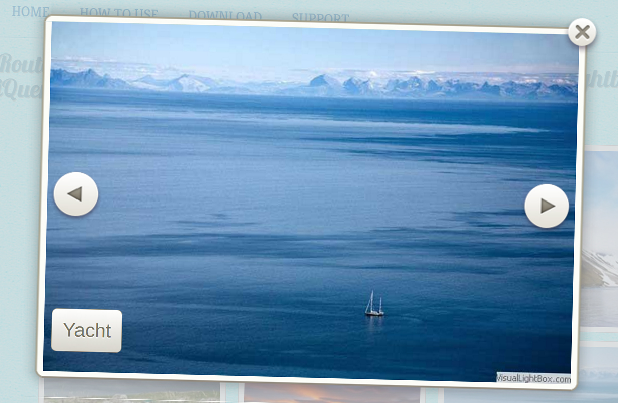
This Route Slider encompasses outstanding nature landscape images. It will impeccably match the concept of a travel agency, ecological conservation organization and other companies. Hovering over the thumbnails of the natty lightbox darkens beautifully framed images slightly to make them stand out. At the right and left sides we can see navigation arrows resembling elegant gray circles with triangles inside of them. They disappear with a fade effect and pop up again while switching between slider images. Along with them short descriptions act the same impressing viewers with its facility.
Metro Image Gallery - HTML Image Slideshow
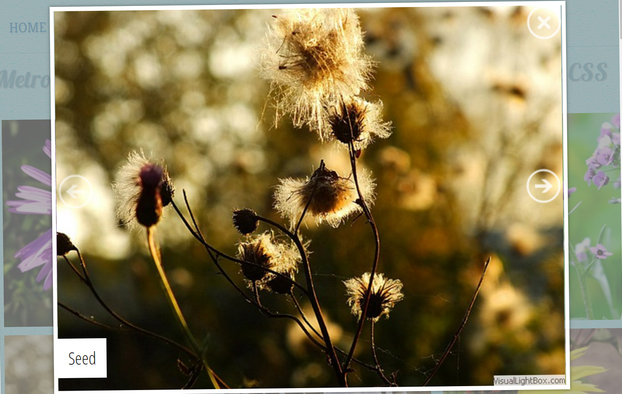
The right slideshow for a floral shop and biologic communities is this Metro image gallery. If you point your mouse cursor on a lightbox thumbnail, you’ll see a description box appear from underneath. If you click on that, the gallery will start. Here you find encircled arrows and description in white and gray colors allowing users to switch pictures in an easy way. The gallery frame resizes smoothly according to the picture size.
This glorious slideshow is fully mobile-friendly, so it can be viewed on devices like tablets or phones as well as desktops without any troubles.
Mobile-friendly Bubbles Slider - CSS Slider
This slider is very convenient and straightforward. It plays continuously, and since it reaches the end it scans backwards, arrives for the first picture, and automatically replays the total set right away. Users can determine which picture they would like to view by simply clicking the thumbnail picture gallery located directly beneath the slide show whenever. Additionally, hovering within the thumbnail displays the look header. The photos are large and have the ability to expose details that can otherwise escapes the human eye. Due to this pictures must be hi-res and quality.
Kenburns Photo Gallery - CSS3 Carousel

The non-jQuery photo gallery is created using solely CSS and it provides a great way to showcase your photos and to let visitors to your website see the very best of what you have to offer. It has a beautiful transition effect, with a slow and steady pan toward the center of the photos, so your audience will have a chance to see every detail that you want them to. Between its visual appeal and its full complement of controls for the viewer, this jQuery-free gallery will be a surefire hit with anyone who comes across your site.
With its relaxed pace and versatile look, this demo is the perfect CSS photo gallery for an artist’s website, an online clothing store or a site dedicated to travel.
Dodgy Image Gallery - Bootstrap Image Slideshow

A modern frameless design, this slider keeps control buttons to the edges so that the viewer’s focus is on the images. Simple, bold styling makes this slider ideal for contemporary websites.
For navigation, the jquery image gallery has oversized arrow controls at each side. By hovering over these arrows, the user can see a thumbnail preview of the next or previous slide. The desired slide is brought forward by clicking on the appropriate arrow. The double arrow design on the navigation controls adds to the modern appearance of this slider.
The basic design of this slider is perfect for modern websites that value intuitive design and simple displays. Let your images speak for themselves.
Boundary Content Slider - CSS Image Carousel
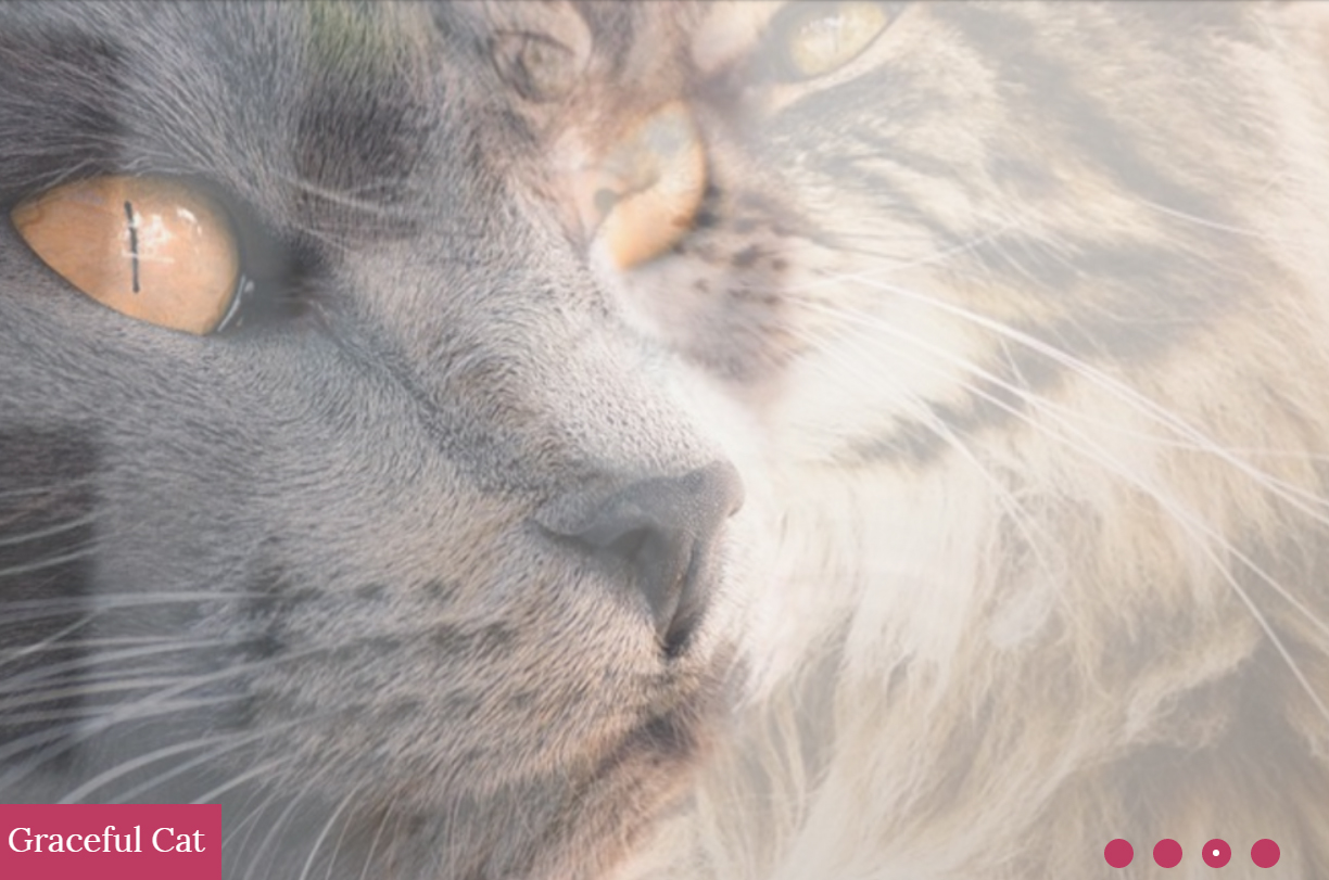
This slightly unusual slider theme is very modern and attractive. It is a more ‘square’ shape than most website sliders, which allows is to work for images that aren’t landscape. It could be a great addition for a portfolio website, or to showcase portraits of people and animals.
The slider uses a deep burgundy color scheme, offset with white. It’s an unusual and striking color that suggests luxury and sophistication.
Each image in the slider zooms in and out, slowly fading at the same time to reveal the next image.
Brick Content Slider - Bootstrap CSS Image Slideshow
The transition effect is what makes this carousel truly amazing. Each slides plays for as much as three seconds before another image replaces it.
This example presents the slideshow during a wide excellent panoramic display that is sure to amaze everybody that sees it. This example features very little clutter as you possibly can to guarantee the pictures are displayed without obstruction generally components disappearing when not being used. The standard animation effect is Brick, which slides images in through the right. Again, the transition is not hard but sleek. The overall outcome is a slideshow that has been modern and elegant but simple.
Mobile-optimized Showy Carousel - Wordpress Carousel
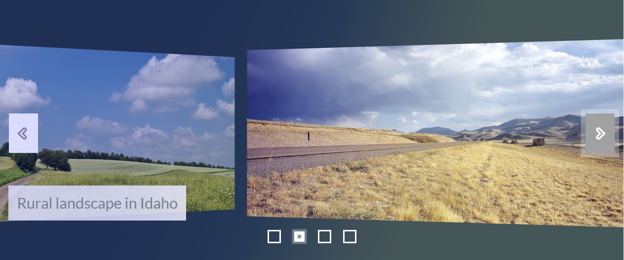
The animation effect is what makes this carousel really enchanting. Each slides plays for about three seconds before another image replaces it. In the event the image is beginning to change, the upcoming image’s shadow arrives in the left, and externally the border. As soon as picture has replaced the present one, users could see the shadow in the leaving photo externally right in the frame. This effect truly illustrates the look and attracts the user’s interest, which is the reason it will look nice for photography or travel web sites, mainly because attracts people.
The usage of bullets will make it clear what sort of navigation system works, which means this slide show is easy to understand and employ.
Dominion Slideshow - HTML5 Image Carousel
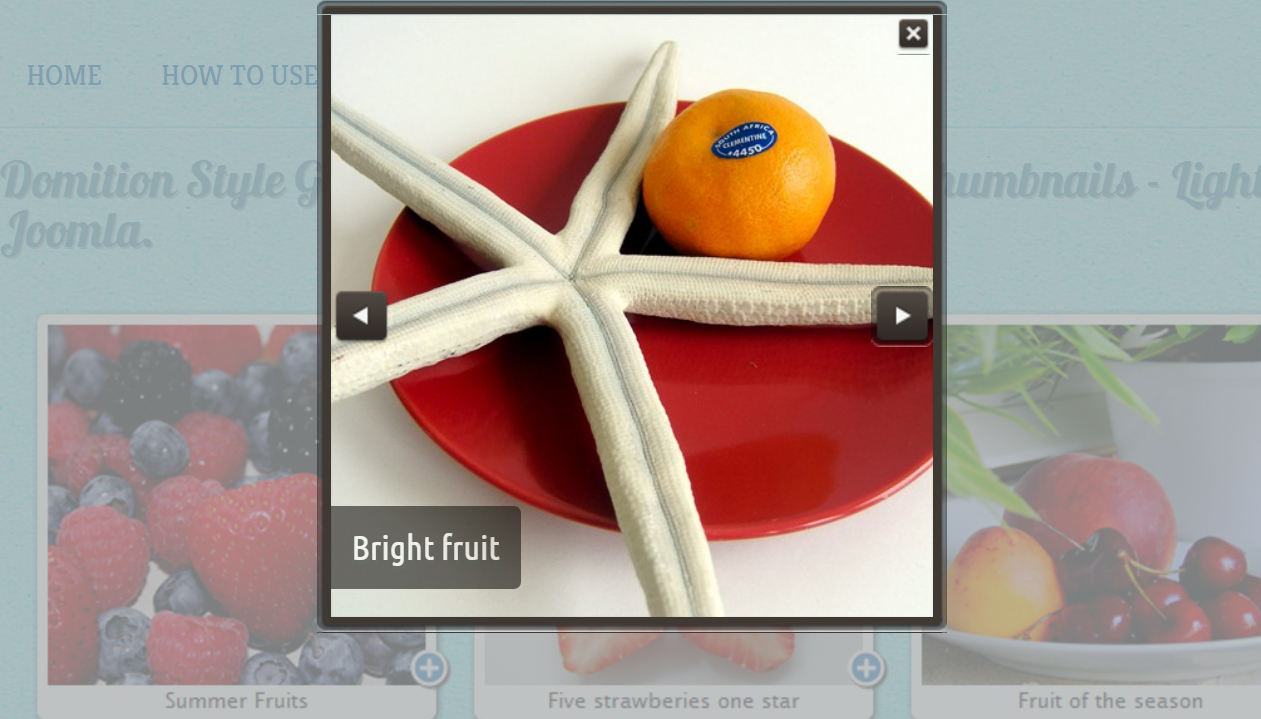
In this gallery each thumbnail has a light frame with description and plus buttons looking wonderful on any device. The theme of this slider can resemble a Summer Breakfast. Opening the main gallery shows a darken frame instead which best contrasts with the first one. To emphasize the image in the center there is the gray semi-transparent background. The dark arrows appear once you hover over the image. This slideshow will fit on the menu page for a cafeteria or restaurant to show available desserts.
Showy Slideshow - HTML5 Carousel
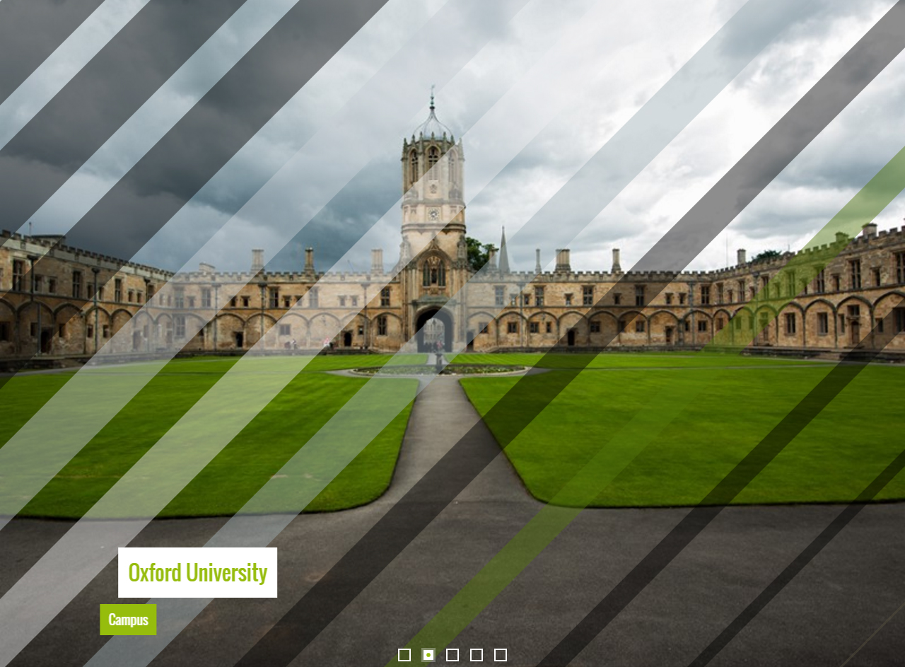
A deceptively and enticing simple design with eye-catching smooth effects, these are the highlights of this demo slideshow created using the awesome Wowslider. The pictures rotate smoothly in and out producing a striking and attractive effect.
Each image of the wonderful Oxford University is displayed for an enjoyable duration. And in case you want to go for or backwards a bit, you can find an arrow each on right and left slideshow ends.
Every arrow automatically highlights once you move the cursor over it and disappears smoothly. The design is simple green on a translucent white background. The angled edges offer a sense of modernity to the arrows.
Fade Slideshow - Bootstrap Image Slideshow

This is a relaxed, cute and playful slider design with a slightly feminine look and feel. It would be perfect for websites with an arts-and-crafts focus, for bloggers, or for romance and chick-lit authors.
The design uses a purple and white color scheme, rounded corners, and transparency to create a soft, slightly casual look. Of course, everything can be tweaked and customized in cssSlider so that the resulting slider blends seamlessly with your website.
This slider is an excellent choice for anybody who wants a relaxed slider design that still has powerful functionality and a reliable framework.
Ionosphere Slider - Wordpress Slideshow
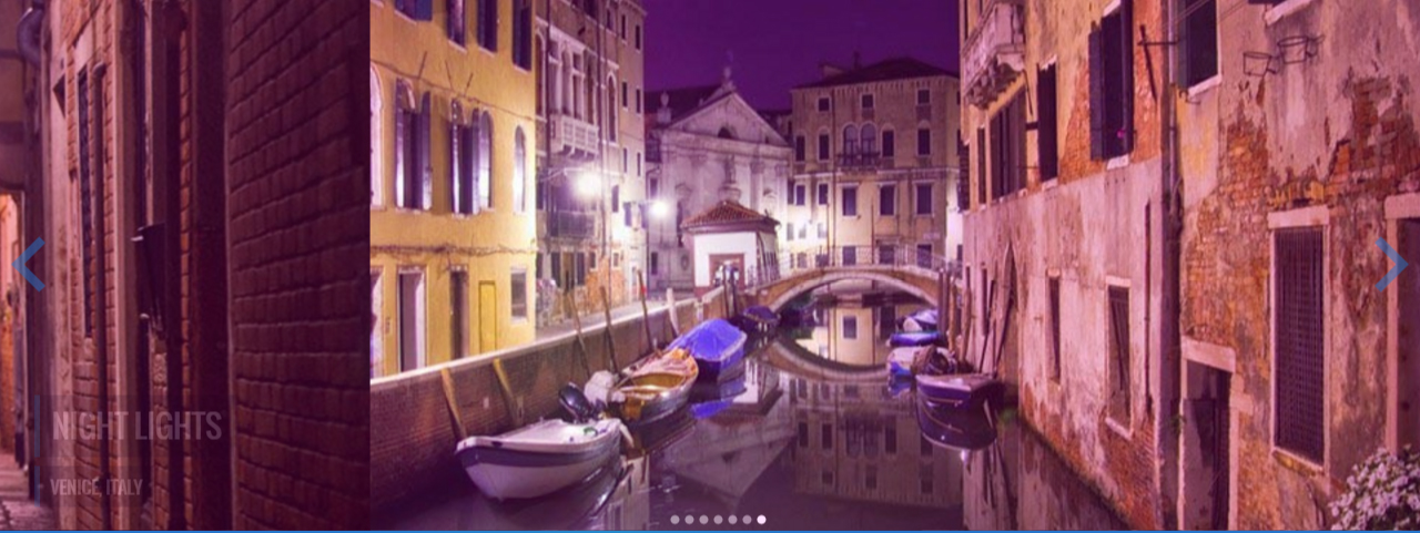
This slider demo utilizes the well-known ‘stack’ effect for slide transitions. In this effect, each new slide simply swipes in from the right side towards the left. No fancy popping and distracting magic tricks, a simple swipe. This way, the viewer isn’t distracted and focuses directly on the picture in front.
The slider demo has sharp, angular rectangular boxes for text, placed in the lower left corner. Each box is a translucent black with white opaque writing.
The bullet points are placed in the lower middle in the shape of plain gray circles. Simple blue arrows for navigation are present in right and left side.
Epsilon Slider - jQuery Slideshow
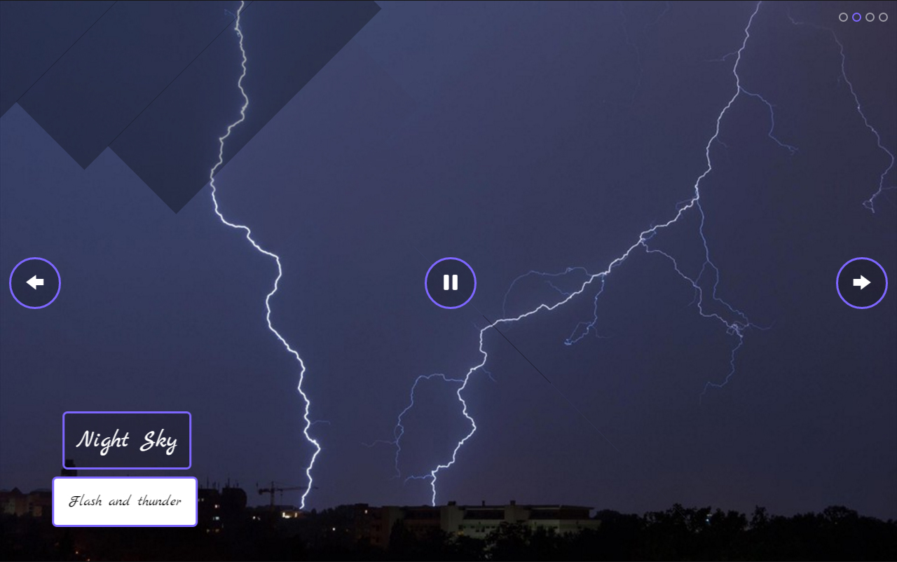
The slideshow has very minimal features to maintain its simplicity and crisp look. It has a very thin white frame that would work great as a header slideshow for sleek and modern websites that want to portray a neat and professional look to its viewers, such as wedding photography sites, or a studio product photography website.
Above the slideshow, there are small boxes that feature small previews of the images that are in the slideshow. This makes for quick switching of the slides. Each box of preview is highlighted with a purple border. The previews are slightly dulled so that each preview on mouseover can stand in darkness contrast to the others.
Mobile Sunny Slider - HTML Carousel

This Sunny Fade slider template offers a soft and very chill transition from slide to slide, allowing your website users to enjoy a relaxing slider of all of your best images. With a built-in preview panel and an audio feature that they can control, both the eyes and ears of your guests will be entertained while they check out your pictures at their own pace. As always, you’ll have the best slideshow technology at your service, allowing for glitch-free and uninterrupted displays that are sure to stay in the minds of your customers for days to come. WOW Slider’s templates work equally well whether your audience is using it on a desktop or mobile device, so it will never limit your ability to capture the imagination of visitors to your site, no matter how they are accessing it.
Slim Slider - CSS3 Slider
If you want an elegant slider design with an old-fashioned sophistication then this is the one for you.
The design uses a soft and faded brown, reminiscent of sun-bleached leather, and white. By using only two colors, the design manages to remain simple and elegant but additional flourishes in the typography and UI elements stop it from feeling too stark and clean.
This design is an ideal choice for many different websites. It would work particularly well for antiques dealers, anybody dealing in vintage goods, and clothes designers that channel an old-fashioned elegance and sophistication. It would also work well for historical romance authors.
Non-Javascript Material Slider - Angular Slideshow
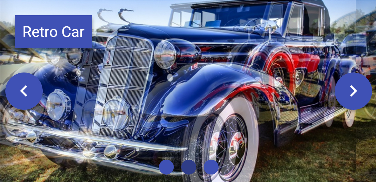
This demo shows off your images in a stunning slideshow that is all about presentation! Arrows and titles are brushed off to the sides and corners to avoid cluttering the screen while always being readily available for easy control and access. You can move forward and backward by clicking on the aforementioned arrows at the left and right hand of the screen which are encased in simple blue circles that go well with the image title's square background and the ones at the bottom of the demo that quickly allow you to skip to whichever image you may wish to see at any moment. You can also scroll through them by clicking and dragging the mouse over the photos if you desire.
Bootstrap Gallery - Free Slider

Bootstrap provides a thumbnail component that is designed to showcase linked images in a grid with thumbnails. Clicking on the thumbnails of this wonderful gallery brings up a full screen slider window with new phone images. This slider is responsive what means it resizes to fit the screen it is being displayed on.
Site visitor can get to any image using white bullets at the slideshow bottom. The easy yet smooth transition effect gives an appropriate way of showing the website content.
Adding a css image gallery to your website does not need to be difficult or time-consuming. It’s obviously the best way to liven up your website.
Bootstrap Carousel - HTML Carousel

To embed a stunning image carousel that’s really modern of its web nature, you can use this slideshow based on Bootstrap – the most powerful and reliable framework. It will fit the screen of any device providing a polished look and feel charming your site guests and making them stay on your page.
The Slider is full screen sized giving an ambient feeling perfect for presenting goods and services. The rectangle white arrows are placed on the right and left image ends. The white modern bullets let user easily navigate through the whole slider.
Responsive Angular Slider - Wordpress Carousel
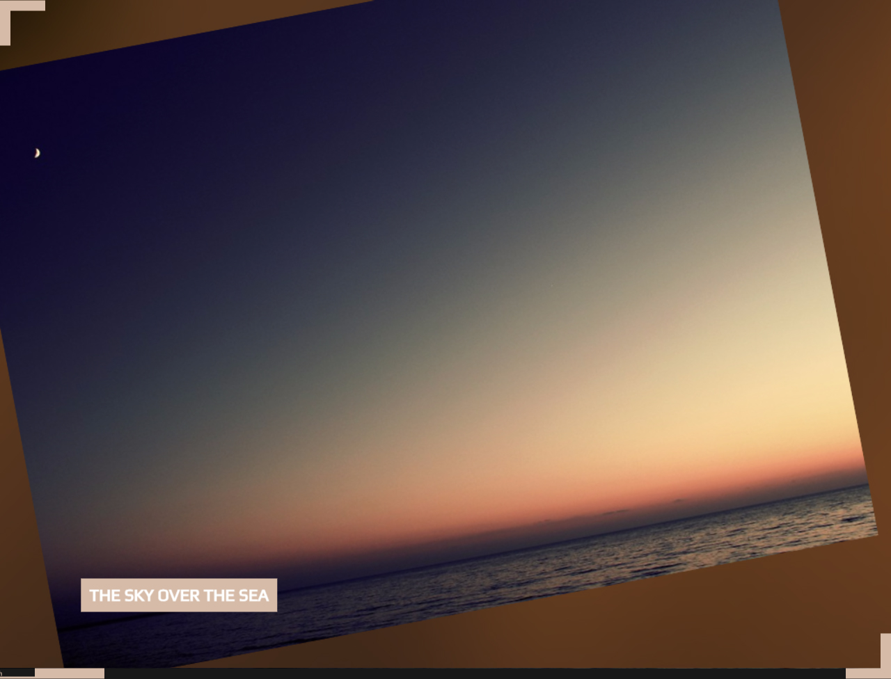
This Demo Slideshow will fascinate quite everyone with its user-centricity and responsive design. It shows a colorful evening nature soothing anyone who looks at its sundown images. User can proceed for or backwards clicking on the bottom-right or top-left arrows like angles as well as on preview buttons at the bottom. Therefore this slider template is called Angular. There you’ll see small pictures for skipping slides and going to the slide user want to look at. This Collage effect with its throwing pictures into the background and picking up these from nowhere will excite your site audience providing unforgettable user-experience.
Carousel Slider - Angular Carousel

Many slider designs look extremely similar, and it is hard to find one that stands out and is memorable. This theme from cssSlider avoids that problem by being extremely unique in every aspect, whilst still looking professional and modern.
This slider would be perfect for websites that want to be memorable but still look professional and trustworthy. Financial websites would benefit from its clean and authoritative look. Overall this slider design is grown-up, trustworthy and memorable — working for any site that has an adult audience and discusses serious topics.
As with all cssSlider designs, the theme is fully responsive, fast-loading and reliable. There are no images used in the interface, which helps ensure the slider always works perfectly.
Utter Image Gallery - HTML5 Image Slider

The Push Stack slideshow template offers up a sharp presentation for your images, with a dramatic transition from one slide to the next and plenty of convenient controls for viewers. Visitors to your website will be transfixed by the smooth shift from image to image and they’ll no doubt appreciate the ability to stop on images that capture their attention, as well as preview the rest of the slides and go directly to any one of them with nothing more than a click of the mouse.
You can expect the same great performance from this Utter template that you would from all WOWSlider slideshows. They are all made to work well on any device and they’ve been repeatedly tested to ensure that they are free of glitches, providing web designers with a fantastic selection of proven winners for their sites.
