AMP HTML Template - BlackAMP Review pt. 1

The world is changing – we can feel it on the web, see it in the search results and in all the weird gadgets we come to be so used to in our everyday life so we don't even seem to pay much attention on their very existence nevertheless just a few years ago we would be looking at the very same things with amazement. What was at first a science fiction then a lux, like pulling a powerful computer right out of your pocket, giving it commends with your voice and having it talk back is now a regular feature pretty much anyone with a mobile phone can get with just installing a simple app and being connected to the Net.
Following this trend of the way we access the net being more and more shifted to mobiles, making them if not a competitor but at least an equal partner to the regular desktops and laptop computers it's no doubt the Net itself with all the web pages we view every day gets transformed embracing new approaches aiming to provide the regular user more comfort and speed nevertheless of the device he or she uses for interacting with it.
So a few years ago the mobile-friendly web design was born making the pages automatically scale for best appearance depending on the particular screen they get displayed on – something we just accept as natural today. Being considered as useful and improving the comfort and ease of the web page visitors it was massively backed up by the Internet giants as a must and now it's not a trend but rather just the regular way a web page is supposed to appear – we can actually easily spot the outdated once by having to pinch zoom in them on order to read them.
And pretty much the same way as this has started back than today one of the probably most popular search engines – the Google, which in some parts of the world is kind of used for synonym for searching – now tries to push forward a new way web pages should be done – this time aiming not only for comfort on mobiles but also for speed, considering the perfect case of having a powerful phone and lightning fast internet is not the one taking place all the time. Pretty often and quite too many users do have rather cheaper or older phones with limited hardware capabilities and data plans. So aiming to provide such users fast access to the content taking place online the Google guys are massively pushing forward the so-called Accelerated Mobile Pages or AMP – a kind of drastically cut off way of writing HTML pages, combined with the usage of only the scripts form the AMP repository and disallowing the usage of any external references to either CSS or other JS files at all. Some HTML tags are restricted from usage and some – replaced by ones having the amp- prefix as well.
Sounds quite scary, doesn't it? At least it did to me the first time I read about it. And odd as well – like in order to meet the strict validation (a page is either AMP or not – a single mistake is enough for an HTML document to not get verified as AMP by Google) it seemed to me I need to pretty much turn my workaround upside down and I actually didn't see the reason why I should make these efforts.
However, my opinion drastically changed and here is why:
All the AMP pages are getting quite special attention form the search engine developing the Standard – Google that is – getting pushed forward in the search results and on Mobile Search there is a special Results Carousel right on top of the search window showing only AMP pages meeting the conditions of the search.
AMPs are also favored by being cached directly on the Big G's servers so the users are accessing them directly form there – meaning even faster lad times and less load on our own servers.
And probably the best thing is
I don't actually have to take any additional steps or drastically change my workflow to start creating AMP. There is a tool so confident intuitive and easy that even a complete beginner in the world of web could create not only Mobile Friendly but also AMP complaint pages with ease And have fun while doing it!The amazing application I'm talking about is the Mobirise Mobile AMP builder which now comes with not one but whole two AMP website templates fully packed with pretty much everything you might ever need for creating a great looking modern and appealing web page and have it instantly loved by the search machine for being AMP.
The page creation process is quite easy and straightforward – the user just has to pick the blocks he/ she thinks can best wrap around the desired concept and alter the text and images right into the Mobirise Builder visual editing interface just like in a regular text editor – the application takes care of pretty much all the rest.
But here is a thing – if you've taken a look at the AMP's page you've probably noticed its pretty simple and more or less – boring. And such come to be quite a few of the pages I've seen promoted in the search results already – these do actually display first by the way. Who wants that? Who cares if the carefully thought and composed content published online will get the viewer fast if then they get pushed back for the page being too simple and looks boring as plenty of the automated AMP pages generated by the CMS solutions? Does the limited by the standard functionality necessarily means compromise in appearance?
Get ready for the best part:
With Mobirise Builder and its AMP website templates the pages created do not only get easily created complying with the Standard but also look good!
How is this possible? Easy – you see, not having anything to do with the AMP lately the latest trends in web design are actually aiming for simple clean and straightforward appearances saying more with less, leaving space for the content to breath and using rather clean blending into the background images and a lot of solid colors backgrounds. The complex background Parallax effects and animated entrances are gradually stepping back.
This rising trend in web design gets ingeniously implements with the means of AMP in the blocks of the Black AMP HTML template.Using all the tools in the AMP armory the Black AMP HTML template design team has prepared pretty much everything you might ever need in order to create a great full-blooded and trendy web page by just throwing the needed blocks in and adjusting the plenty available options by just flipping some switches form the cool Properties panels each block comes packed with.
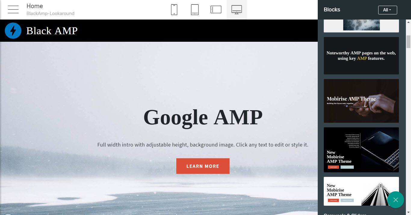
Additionally, as in each Mobirise Builder AMP HTML template, the blocks come comfortably grouped in the Blocks Palette in the way they more or less should appear in the actual page – not as a mandatory rule but rather as suggestion giving the novice user a tip – you can order them any way you like.
So in this one we're going to take a look at all the goodies The Black AMP Mobirise Builder theme hides and I'm pretty sure at the end I'll leave you confident that AMP pages can not only be done easily by pretty much anyone but also – actually look good!
The Black AMP website templates - Navbar
Or the navigation of the page comes with two independent appearances. You can have it either conventionally arranged with the brand name and logo to the right and the navigation toggle – to the right
or you can also take advantage of your brand identity appear centered on screen
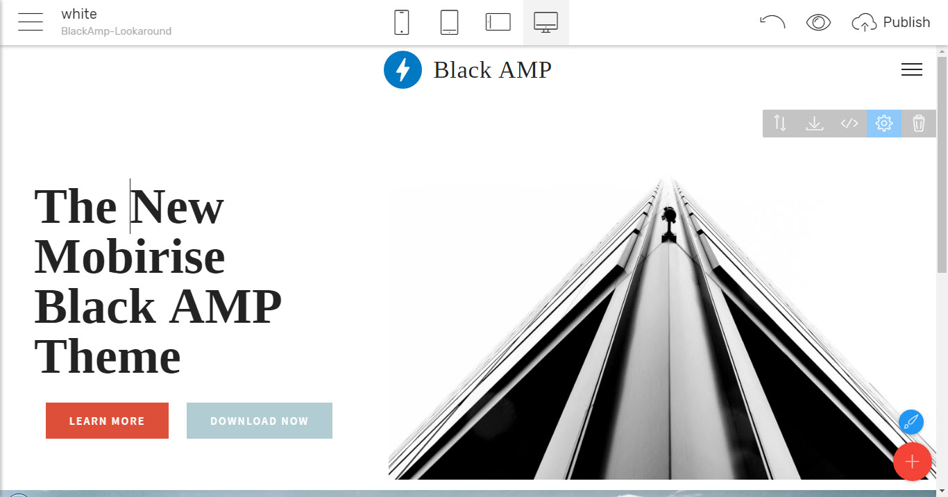
And as you can see form the very first screenshots of the Black AMP html template – even the most basic navbar background colors can be easily combined with the block underneath it creating a great first impression on load.
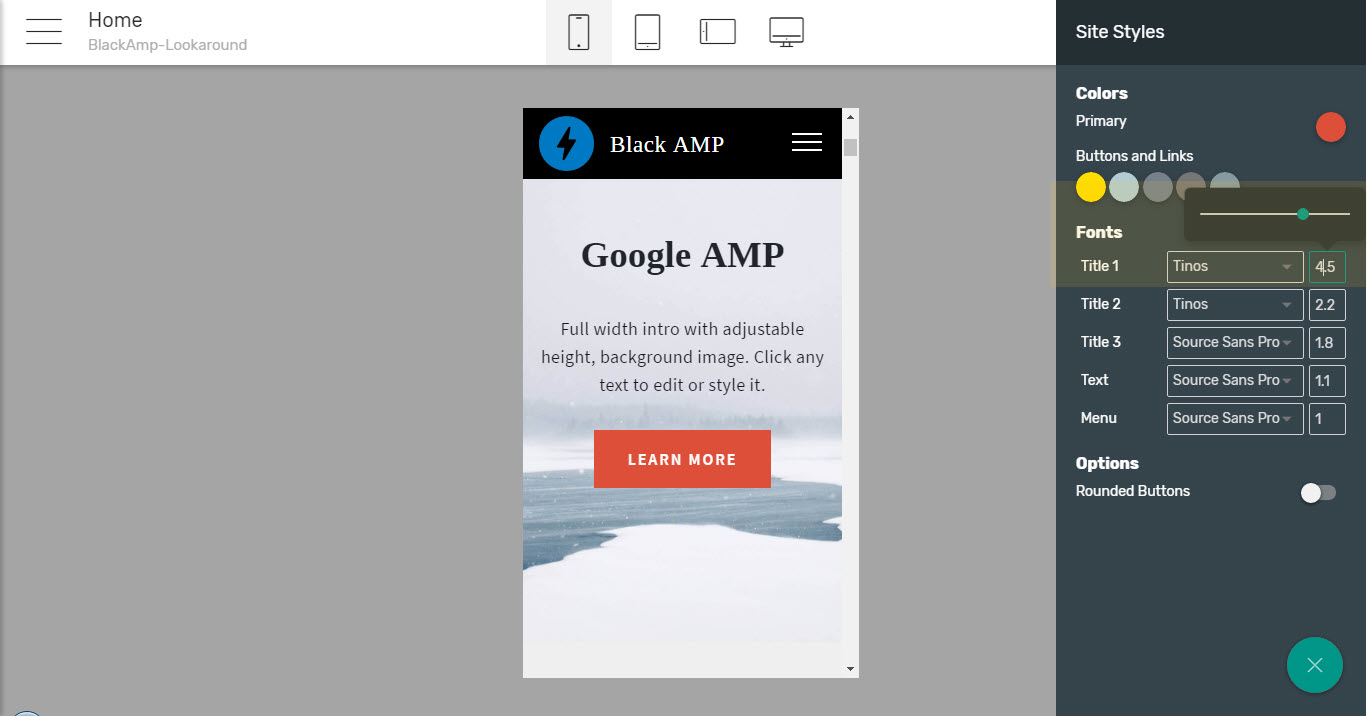
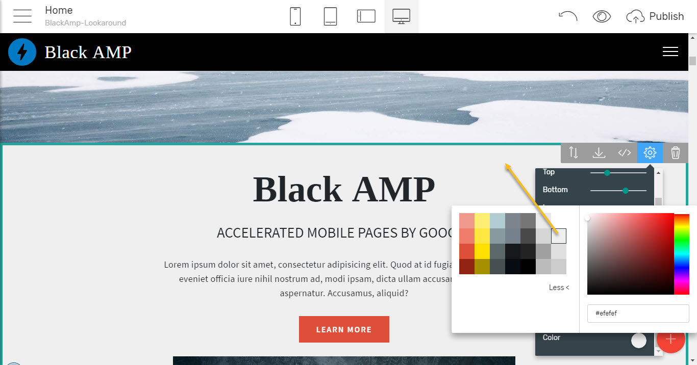
Taking a look at the Navbar's Properties Panel we notice something which at first might look a bit confusing – especially for the experienced Mobirise Builder users there are two sliders for adjusting the Logo image's size - Logo Height and Logo Width
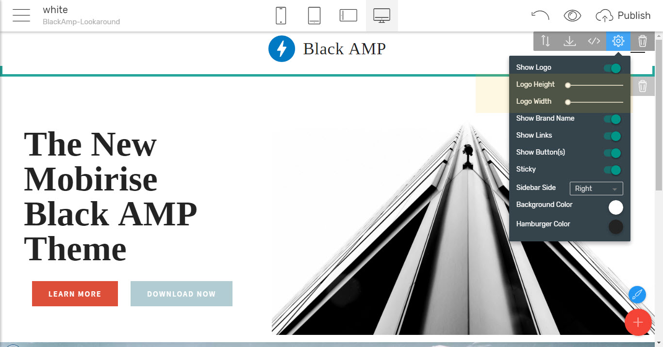
this is due to some of the AMP-specific requirements – like some of the elements having their dimensions explicitly defined so the browse know just how much space to consider for them from the very first glance on the page's code – this way no "glitches" pushing the page's content around are possible when an element gets loaded taking its place "pushing" the adjacent elements around.
So in case you just need your brand's image slightly resized from the way you see it initially appear – just make sure you're adjusting it with the both sliders having the same value. And in case you decide to add some extra touch slightly distorting the logo – you don't need an image editor for that – just use the sliders with different values.
Experienced Mobirise Users tip: Do note unlike the regular Bootstrap4 powered Mobirise Builder themes there are no two stages in the appearance of the navbar – like initial stage with the Logo a bit bigger and Scrolled down stage when the Navbar and its content scale down to fill less of the view. The size of the navbar in AMP remains the same all the time since there is no script changing its appearance for performance reasons. You still can however decide if you want it Sticky taking place on top all the time or not – getting scrolled up with the page.
Another interesting thing to note is the navbar elements are transforming universally all over the page so a change on one page gets automatically reflected all over the project where this navbar takes place. Additionally – just remove the navbar you've inserted on a page and replace it with the other one – it also change universally on each page it takes place but independently from its "brother" – the other navbar block So this way you easily have two independent still globally changing navigation elements in a single project – not the most common thing to see but sometimes- quite needed.
Now after we've taken care of the element holding the site's structure and helping the visitors get around (to which we'll come back many times refining it later on as the project advances) it's time for
Grabbing the visitor's attention
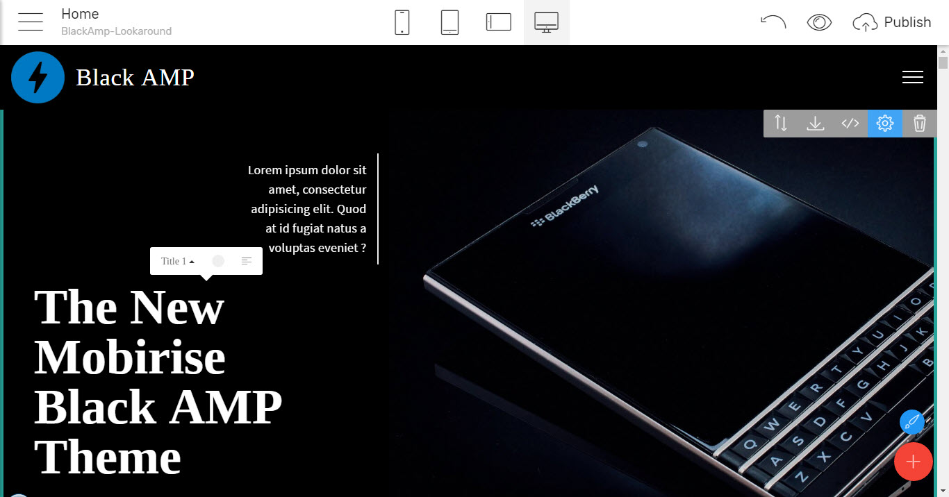
With some of the blocks form the Headers section or the so-called Intro blocks. There are quite a few of those available in the Blocks Palette gradually advancing in complexity – starting form the most classical single image with a heading on top of it
through an the combination of a background image or a solid color and an extra image placed over them, finishing with the heading and some quotes eventually placed inline with some imagery content blending nicely with the background chosen – as in the screenshots from above.
What's interesting to note here these are nothing less than attention grabbers telling a whole story with a few lines and a picture. The details will get told later on with some blocks form the other sections.
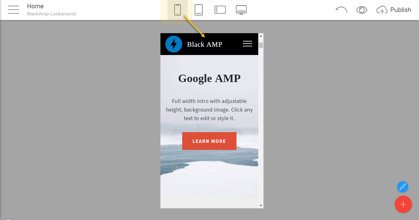
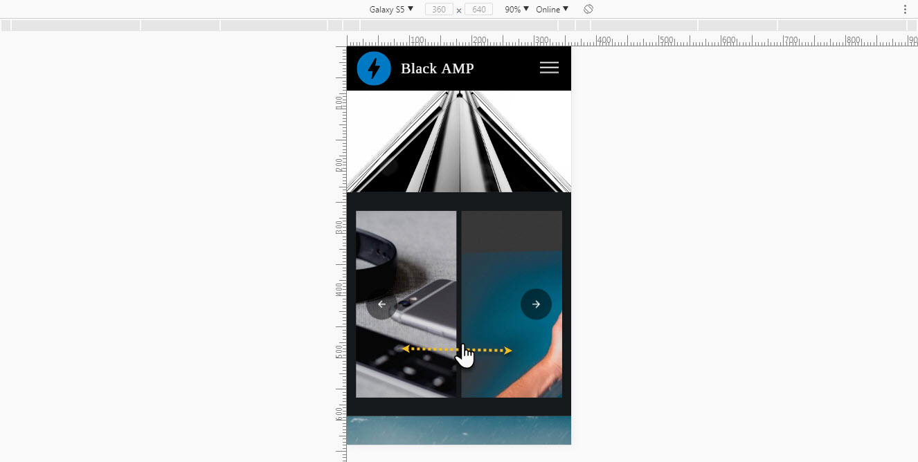
The headings are large and bold. They might even appear a bit too much viewed on your desktop but do have in mind – AMP is meant mostly for mobiles especially having in mind there might be smaller screen device viewing them, so just clicking on the Mobile view button in the top bar reveals right inside the Mobirise Builder application how nicely this will actually get rendered on minor viewports.
Frankly I kind of like these bold large headings bordered with a lot of free space around – this way the viewer's attention gets grabbed and there's nothing around disturbing. I'm suspecting this is part of the design line the whole amp html template is following. However if for a reason you need it reduced on some of your projects – no matter initially or at later stage just experimenting with different appearances – just head to the Styles Panel and set the desired size for pretty much any of the text elements with a click – the changes will get automatically spread all around.
Taking a look at the some of the Headers block's Properties Panel reveals to the experienced Mobirise Builder user a significant difference.
In the Bootstrap 4 powered themes we got pretty much taking for granted almost any blocks could have not only a solid color or image background but also a video, a nice semitransparent color overlay layer on top of them and the option for letting those scroll down with the so-called Parallax effect where the block content scrolls down with the speed different than the one of the background creating the feeling of "depth" – there are not present in AMP website templates. I'm guessing for two reasons:
- performance and the AMP requirements for utilizing scripts different from the one in their own library on page – which gets the Parallax and the Video player out of the picture
and
- the overall flat and appealing styling of the amp html template focusing on the content and using rather clever implements of the simplest things than complex visual effects that can be sometimes hardly seen on mobiles
Actually the predefined appearances of the blocks – not only in the Headers section but all around are not only an initial placeholders to take place in your project but quite often also tips trying to give you an idea about how to use your own content achieving great effect with minor efforts – just take a minute to look them over and you'll see it.
Here is a cool example about that:
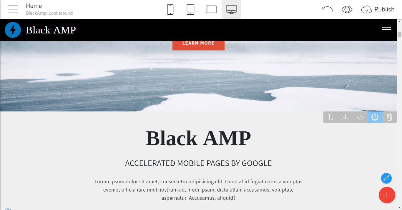
You see how the lower block's background kind of continues in the snow of the one above? That's nothing more than the lower block having pretty much the same background color as the show in the background of the one above.
And you can easily select the proper color to implement this with your own images from the convenient color picker feature for each block's background.
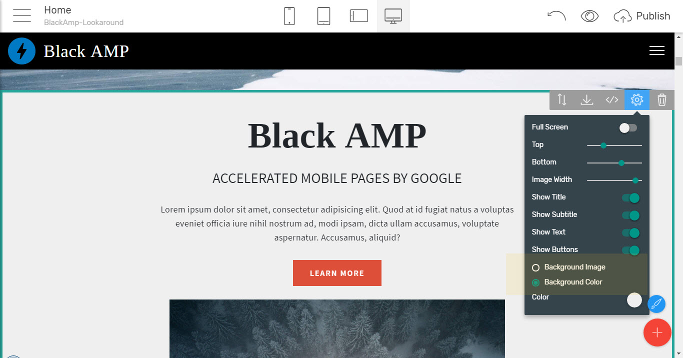
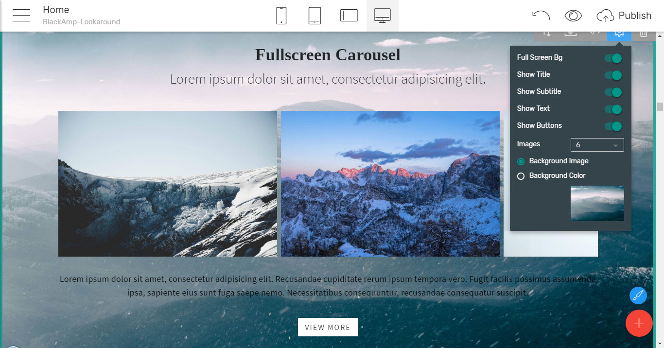
Regarding the layout of the Header's blocks, there is one more thing to note – you can have them automatically resizing to either spread all over the screen of the device the page gets viewed by switching the Fullscreen feature on
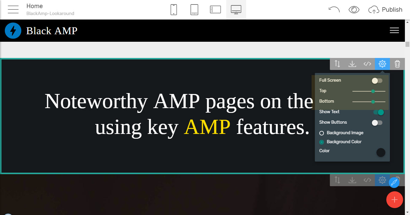
Or carefully adjust just how much free space you need around your content with the convenient padding sliders, which by the way are part of pretty much all the Mobirise Builder blocks.
Scrolling down the Blocks Palette we come to the very next blocks section giving us a clever way to
Showcase our images in a cool and innovative way
Think of Instagram sliders where you just need to swipe aside and have all the images shown to you without having to leave the feed – right into the very same frame. That's pretty much the main idea behind the blocks in the Carousels and Sliders section which in AMP come replacing the Carousel and Gallery blocks we got used to in the Bootstrap 4 themes.
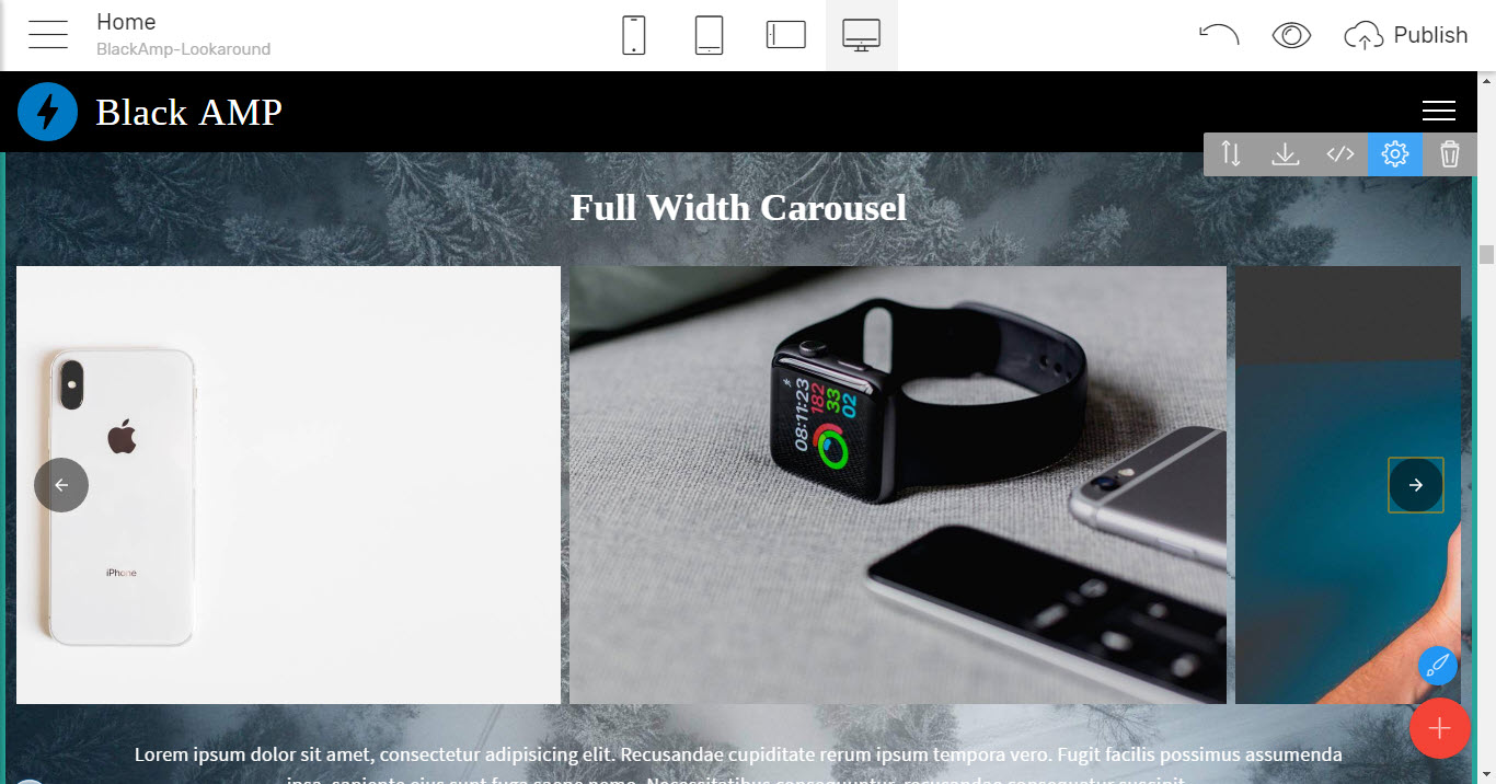
No doubt these are mobile oriented as well since on mobile you can just swipe left/right and take a detailed look at the pictures not having to click on them and have them displayed in a lightbox which in turn has pretty much the same size as the image triggering it but you can click/swipe on images to change them. Now, this gets done right on the page and the convenient Next/Previous buttons make it easy to handle in desktops.
It's actually quite interesting doing this since in some viewports we kind of get this filmstrip appearance showing a few images at a time and personally, I find it quite fresh and amusing changing a few of them in a click.
There are quite a few implements of this main approach in the Carousels and Sliders as well letting you present your great images in pretty much any way possible, starting to form the most general just filmstrip appearance
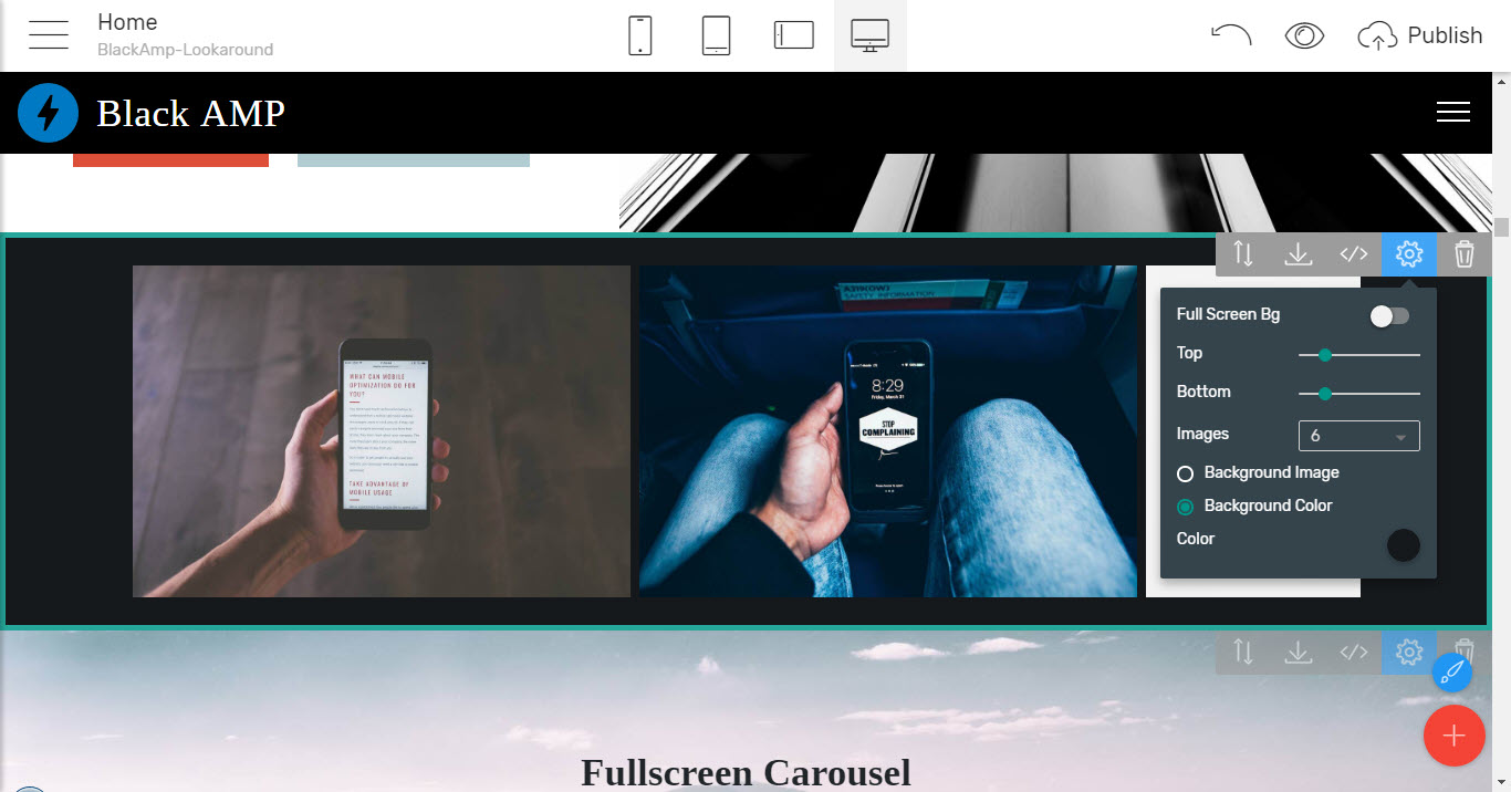
Which however can also be set to fill the entire screen or adjusted in size – pretty much as the Headers blocks above.
Going through some more complex implements giving you the option to have some appealing captions and calls to action combined with an extra image background underneath
A filmstrip leaving nothing but the images themselves
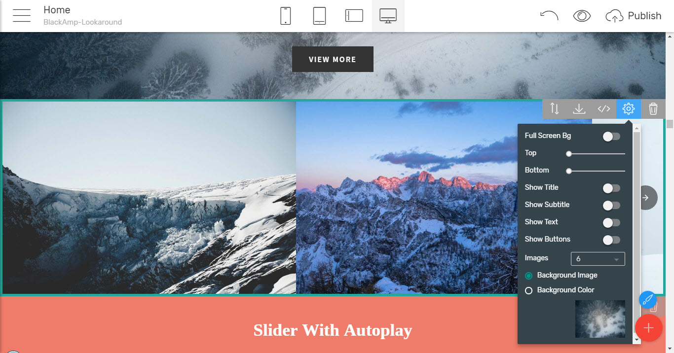
And even an auto play function making the images changing on their own while the user scrolls down the page which in turn could be used as attention dragger or call to action or whatever.
That's the beauty of the Mobirise Builder way of building AMP website templates – one thing can be used in multiple ways
So starting up with two blocks of a kind you can eventually finish with some stuff entirely different – in both appearance and functionality.
Let's take the Carousel blocks for example – each one of the images can also be assigned with quite a few linked functionality
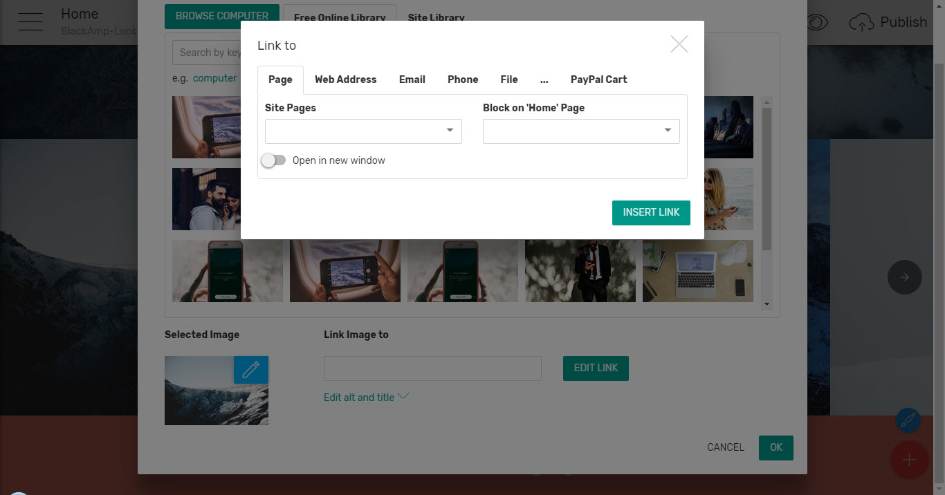
Like jumping to another page in the project, opening an external link or a document you have sitting aside on your server.
You can even set them to launch the visitor's email or phone calls app having your contact directly filled in – so they can just write the message and hit send of directly call you.
So stated this way with just a few minor adjustments and the properly picked up images you can easily make this carousel blocks work as an advertisement area with live links to your products, a clever mid page navigational element or something entirely different – the choice is up to you.
Not to forget – all of these goodies are ending up as an AMP verified page – fast loading and cached by Google – and that's so far just a tiny bit of what the Black AMP HTML template hides within since along with the appealing image slider it's logical to assume you would need just some...