BlackAMP Review pt.2 - Simple HTML Website Template
Clear and appealing images and videos
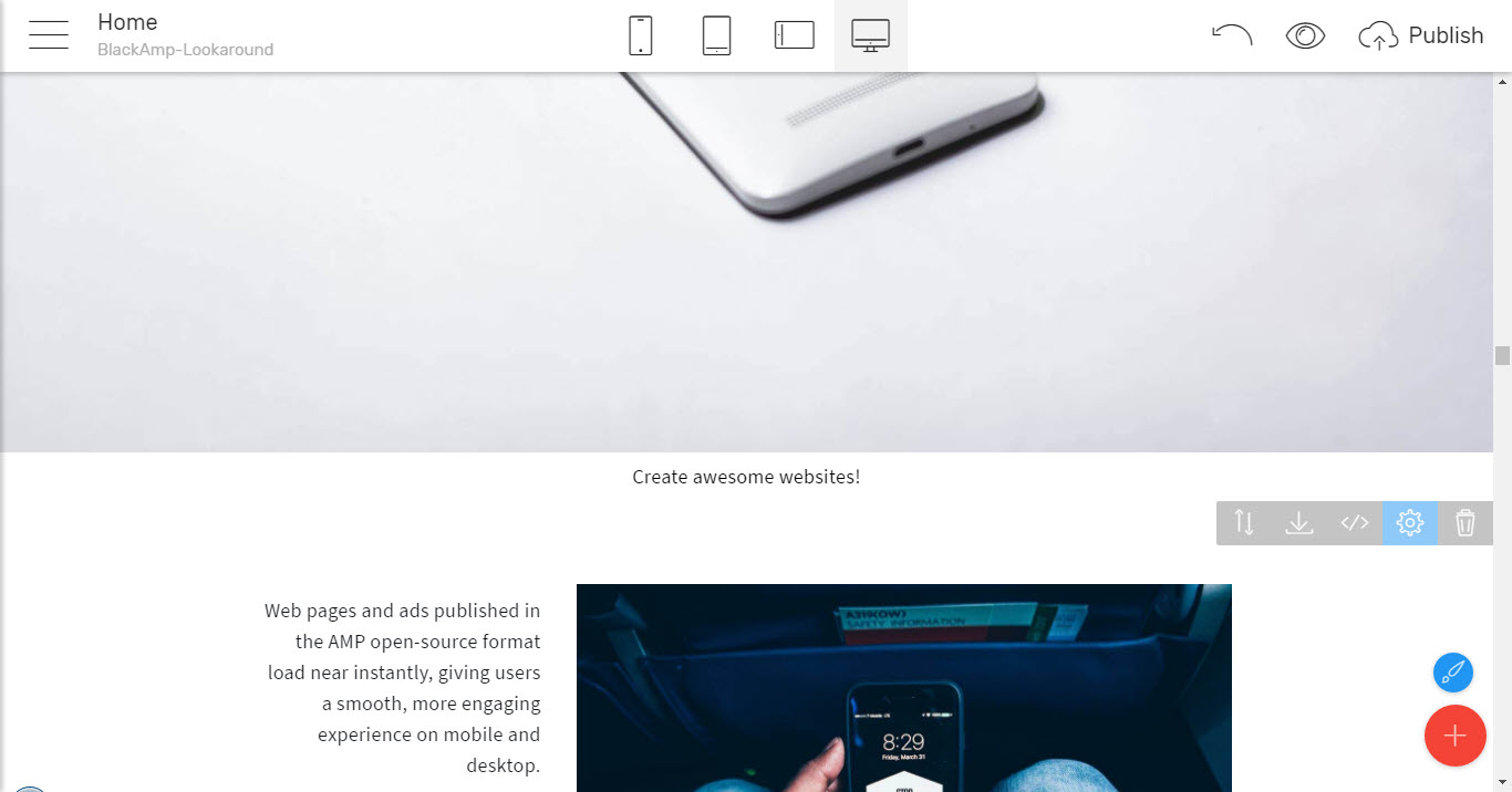
To tell the world your story or showcase your great products. Which in turn leads us to the very next section in the Mobirise Builder's Black AMP Blocks Palette where you can just insert a cool image, spice it up with a caption and some text telling about it or post a short video telling your story.
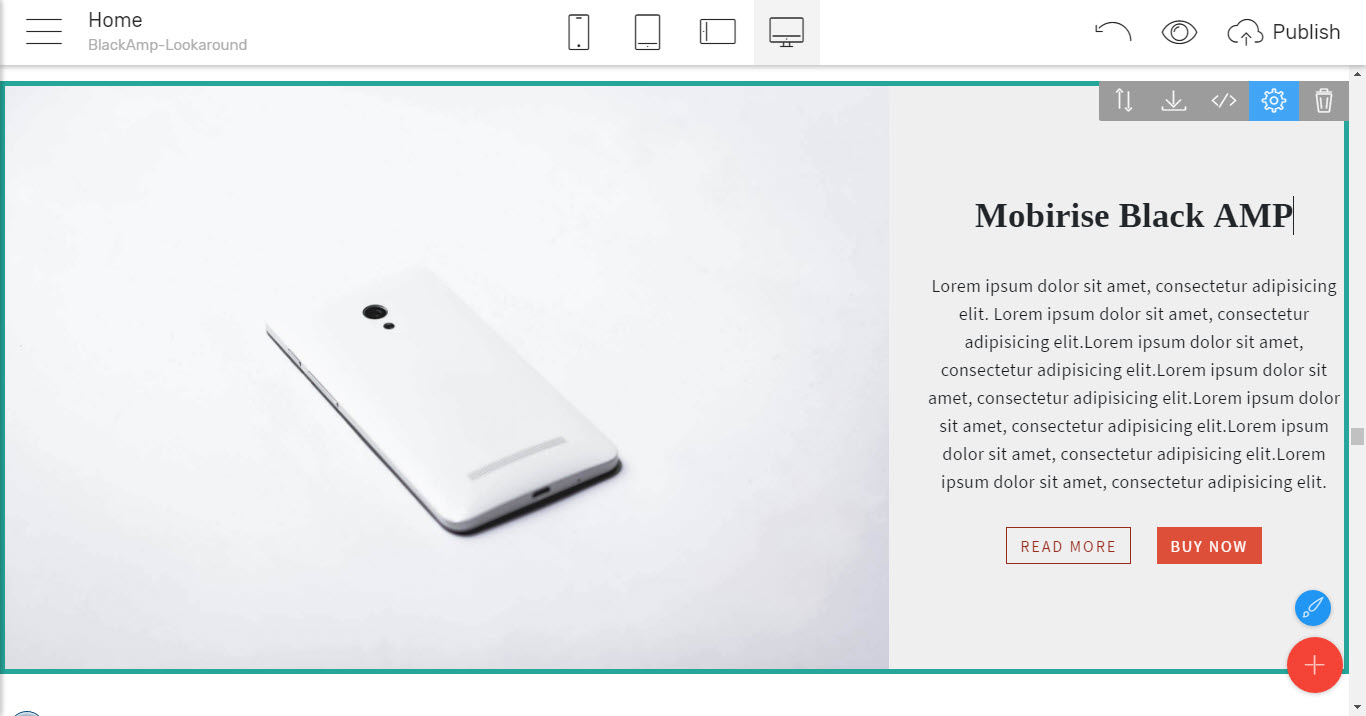
As always – all kinds of flexible layouts are supported – form an image taking all the viewport's width leaving nothing disturbing the view aside, through the image / video with text combination where you can comfortably select the part of the screen you need each part to take by just adjusting the desired proportion
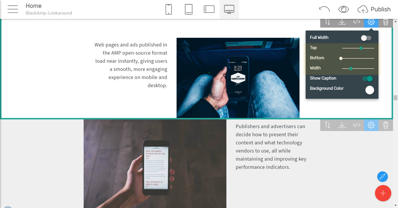
And as can be seen on the image above – using the Paddings slides you can either make the particular images stand up or nicely blend them into a kind of vertical filmstrip grabbing attention and telling your story.
This approach works pretty much the same way with videos as well where the two most popular video streaming platforms are entirely supported – by just pasting the link pointing to your clips already uploaded to YouTube or Vimeo you can instantly have them inserted anywhere you like on your Black AMP simple html theme pages.
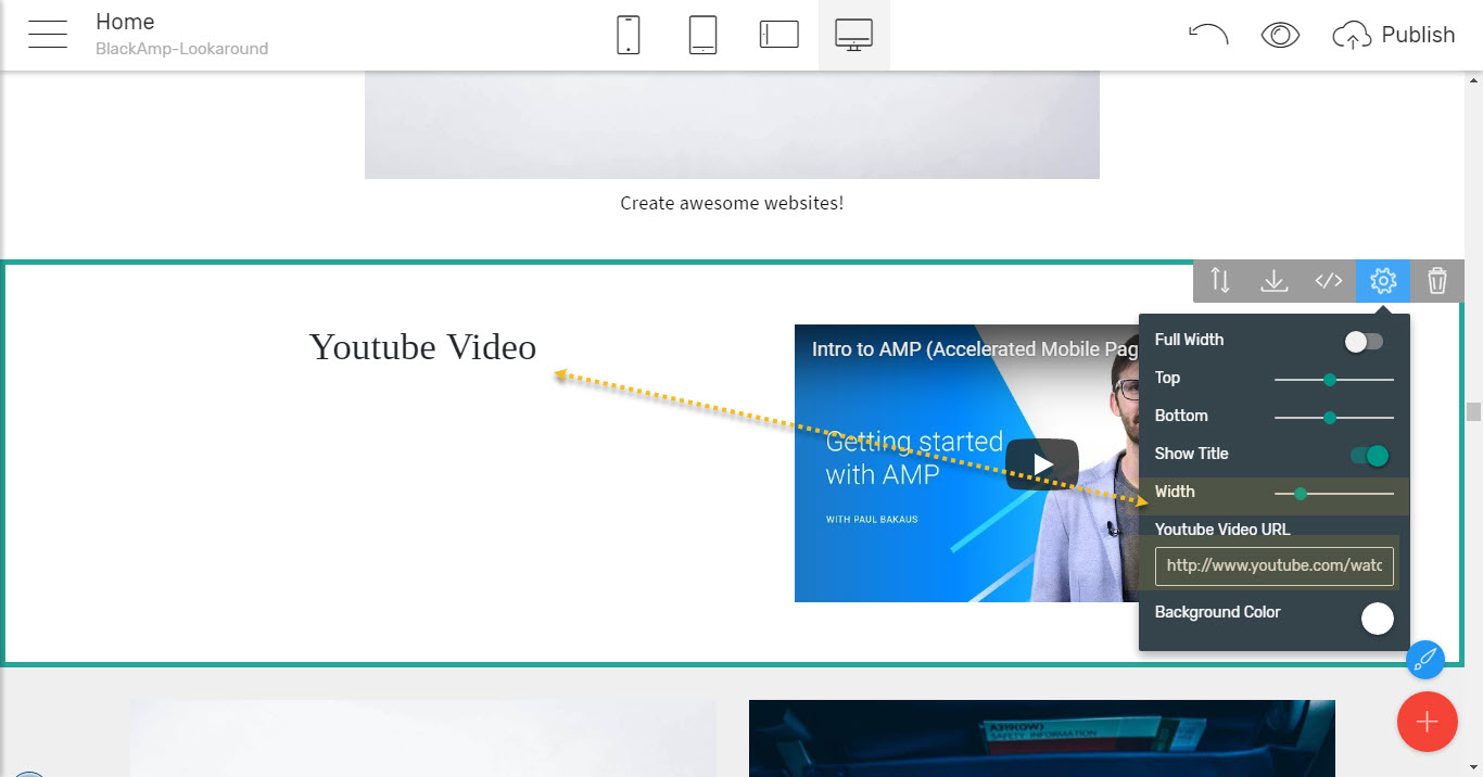
What also got my attention was the layout has been so carefully thought and crafted that for example when you lower the width of the image/ video in some blocks the heading automatically jumps aside instead over it, so the space is always utilized at its best.
There are some clever and sometimes quite useful implements like two images inline with the text block describing them underneath as well. The text width slider in this block initially got me confused since changing it didn't seem to be producing any visible results on block. However, adding some more lines of text in the description revealed this secret since the initial text can’t spread far enough for the adjustment to be actually seen
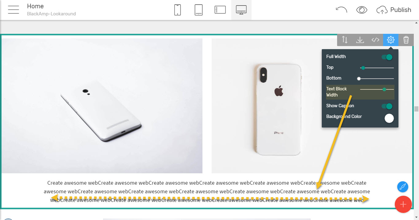
So pretty much all the possible appearances of an appealing image and some text describing it are considered in the Black AMP simple html theme so we can easily make the entrance of the part of our pages where we can
Amazingly describe the significant features making the subject of the page unique
using the blocks from the very next section of the Blocks Palette called – you've guessed it - Features
This probably comes to be one of the most important parts of a project's front page since with the features blocks we can easily describe all what's important about whatever the page is about in tight easy to get and informative way still managing to impress the visitor and giving him/ her the ability to take further action if a particular item grabs their interest – like reading more, purchasing goods and services etc.
In Black AMP simple html theme here we have all the good known and beloved features layouts we're used to from the regular Mobirise Builder themes, starting from the most common ones – like equal in size, adjustable in number cards, containing of switchable image, caption, text and buttons
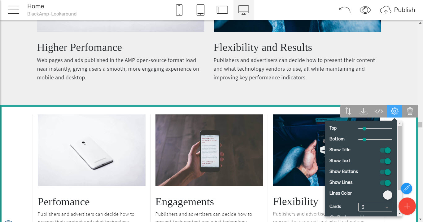
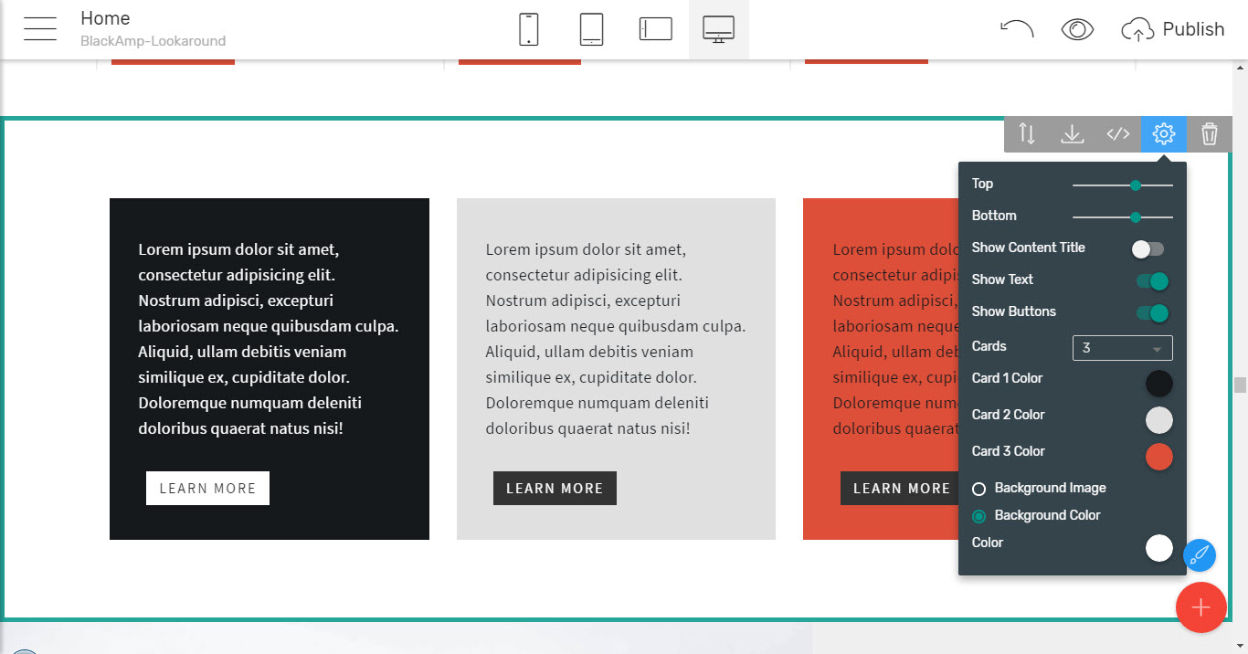
Which are also following the clean and beautiful design line of the theme and as the probably mist universal features element come in quite a few layouts as well – like boxed as shown above, spreading to fill the entire screen with no extra free space between them or even boldly colored – each one for itself and of course – with the ability to fully control each element's appearance
through the single feature on whole screen making it easy to stand up, which also comes with plenty available layouts and the option to have the image replaced by YouTube or Vimeo video
Which are helping you to easily set the focus on what you want most
through the simple but appealing iconic appearances where the tiny images are speaking for themselves making the appearance both interesting and informative
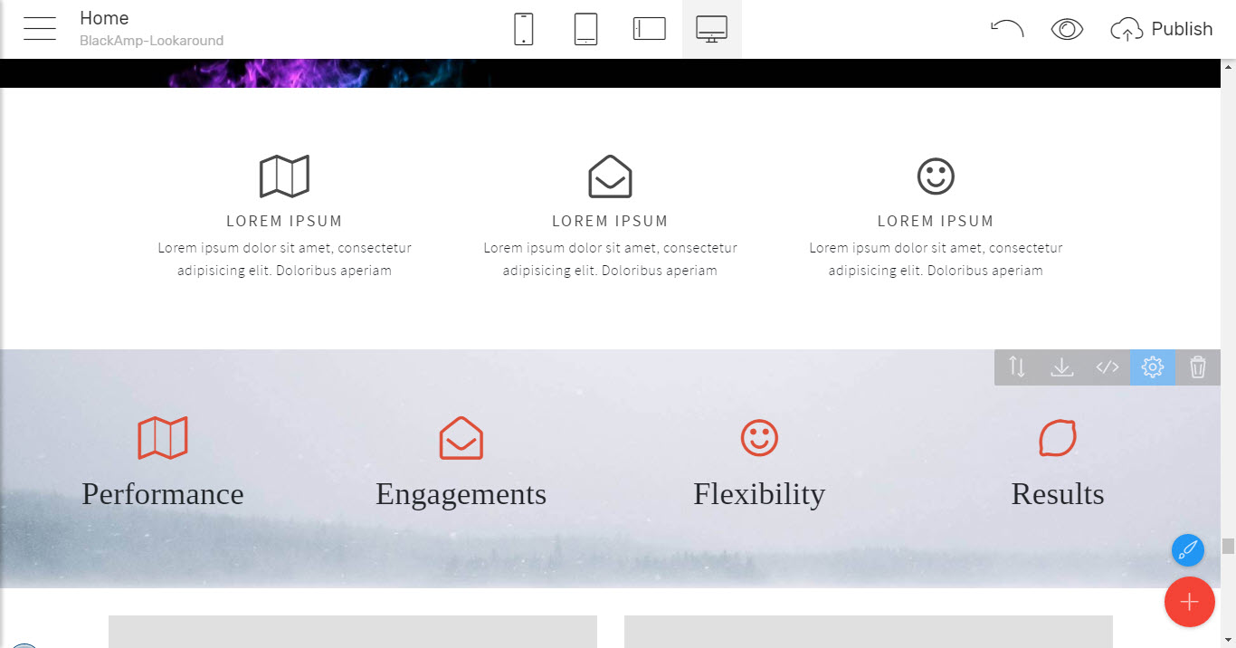
And finishing up with even having a timeline like preset layout where you can select how many feature cards you want following a vertical line switching sides telling a story in a light and a quite illustrative manner
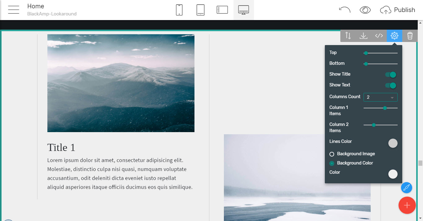
Now all these feature blocks are quite amazing by themselves but what makes them even more useful is they easily work along with each other so a few of them could be used creating a consistent and informative sections on page – like you can easily place the very same block twice, for example, adjusting it to display the two features you want to outline first and then – the rest of them which you think should take place but are not the ones you think are more important easily getting a consistent appearance working great for you.
And of course, each undertaking has some team standing behind it working hard to make it possible. With the Black AMP simple HTML Website template you can easily
Present your team
In quite a few interesting and fast loading ways full of adjustable features.
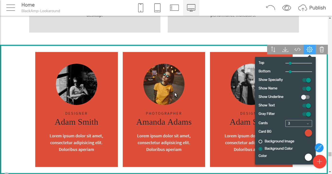
The team blocks are pretty much like the features blocks above in adjustment and functionality but aiming at presenting not just any feature but the live human beings behind the project your next great project will be told about. That's why the design approach is a bit different – the images are circle shaped – pretty much like the profile images in most of the social networks are nowadays making it easy and intuitive for the visitor to associate the team card appearance with the bio info taking place in it. Additionally some extra goodies have been added – like a dedicated feature for pointing out the person's specialty and to make things even more interesting and intuitive – there is a grey filter coloring the image of the team members only when hovered over with your mouse – so the focus gets set to the specific person even more.
All of these cool features are carefully crafted once again so each one of them is switchable on and off for best achieving the looks you're imaging up to the tiniest detail – like the color of the separator line splitting the specialty from the person's name so all that's left for you is to experiment a bit figuring out the appearance suiting you best.
Now, what we've seen so far from the Black AMP simple HTML website template shows how it can be used for creating quite an impressive attention grabbers and images, showcase features and people but all the block up to this point were containing no more than a few sentences of text. This is actually good since no one wants their users being bored form endless texts and browse away but indeed web pages are maybe the most powerful way of sharing information with the world so having some means for doing that is more or less a must. And if it could be presented in a cool interactive way – even better.
That's exactly what the next section does lets you
Organize your important content
Saving screen space and adding a pinch of interactivity involving the users in clicking around to find what they actually need to read instead of endlessly scrolling down to find it.
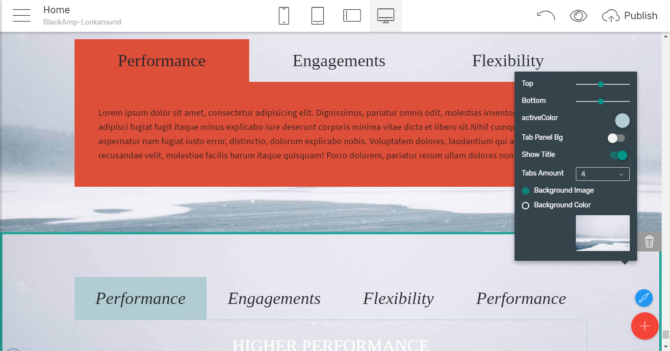
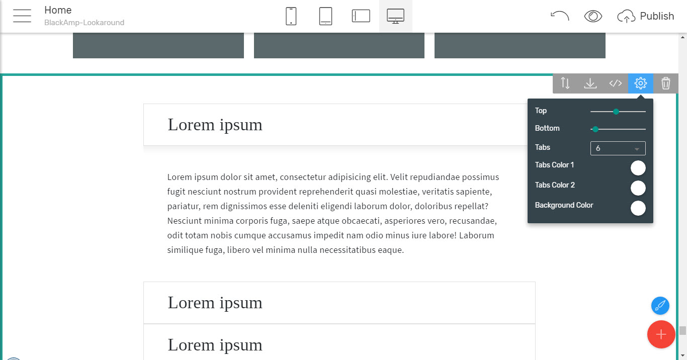
What I'm talking about here are the great toggle and tabs blocks taking place in the very next section in the Block's Palette which can be easily used for summarizing large amounts of data, showcasing a few options in s single screen so the user can easily compare
or just scroll down to the needed feature looking only at the captions and expand it to read exactly the info needed – easily and fast.
So any precious information you have to share can now be given to your audience while you rest calmly it's easy to get around no matter its size. Of course, that doesn’t save you from having to organize it properly in advance so you can easily pour it in once the structure is done. Personally – I used to be doing this (if haven't already been done once I'm starting a site) on paper but it turned out with the great Mobirise Builder editing interface it's sometimes easier for me to clear out my thoughts and figure out the best look right as I do the webpage itself – experimenting with different layouts and structures right inside the Mobirise Builder application.
And if you need to
Share your opinion or tell your story to the world
You can easily do that in the most versatile way with the blocks from the very next section giving you the means for creating the most appealing article you've ever did so far.
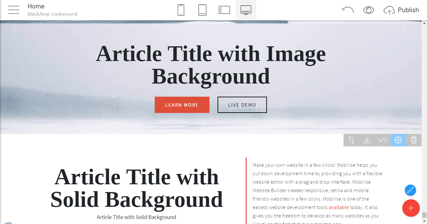
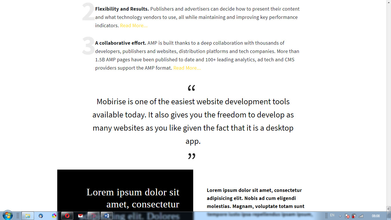
Coming fully packed with blocks for headings, quotes, numbered lists, outlined elements full-width attention grabbers for the most important parts and many more. And the coolest part of this is just like all the rest blocks in the Black AMP simple HTML theme and in Mobirise Builder – these are highly customizable so a single block can take endless possible appearances
And of course - since the people reading this are the one important – you can easily
Get in touch with your audience
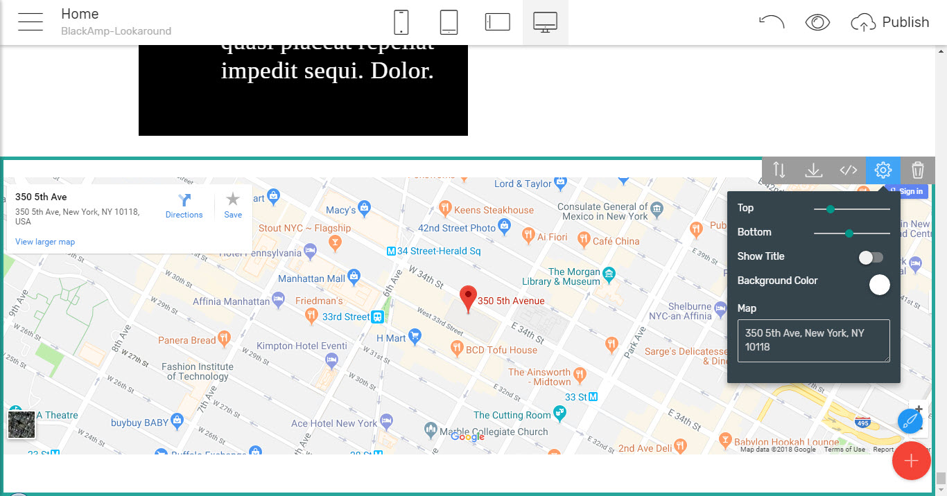
With the blocks form the next few sections in the Blocks Palette offering you the ability to easily place your business on the map by just typing the address or the GPS coordinates of the place
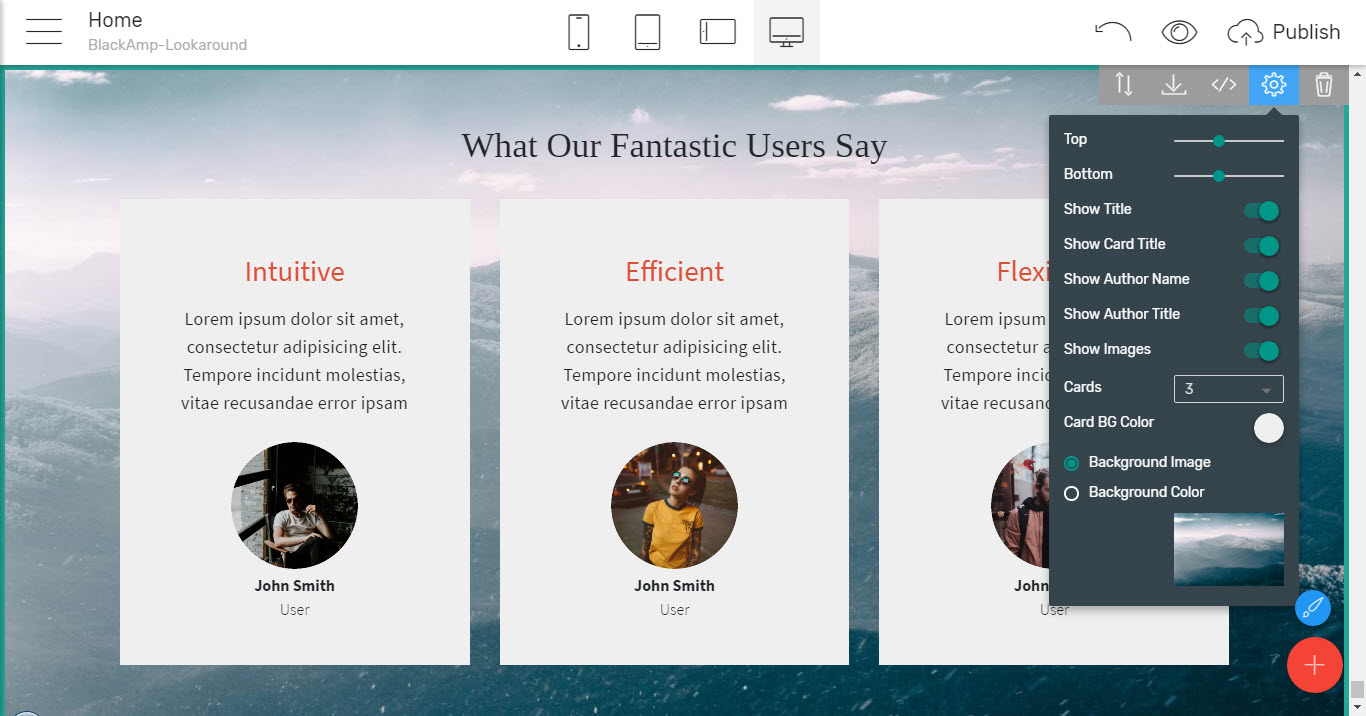
Share some user feedback
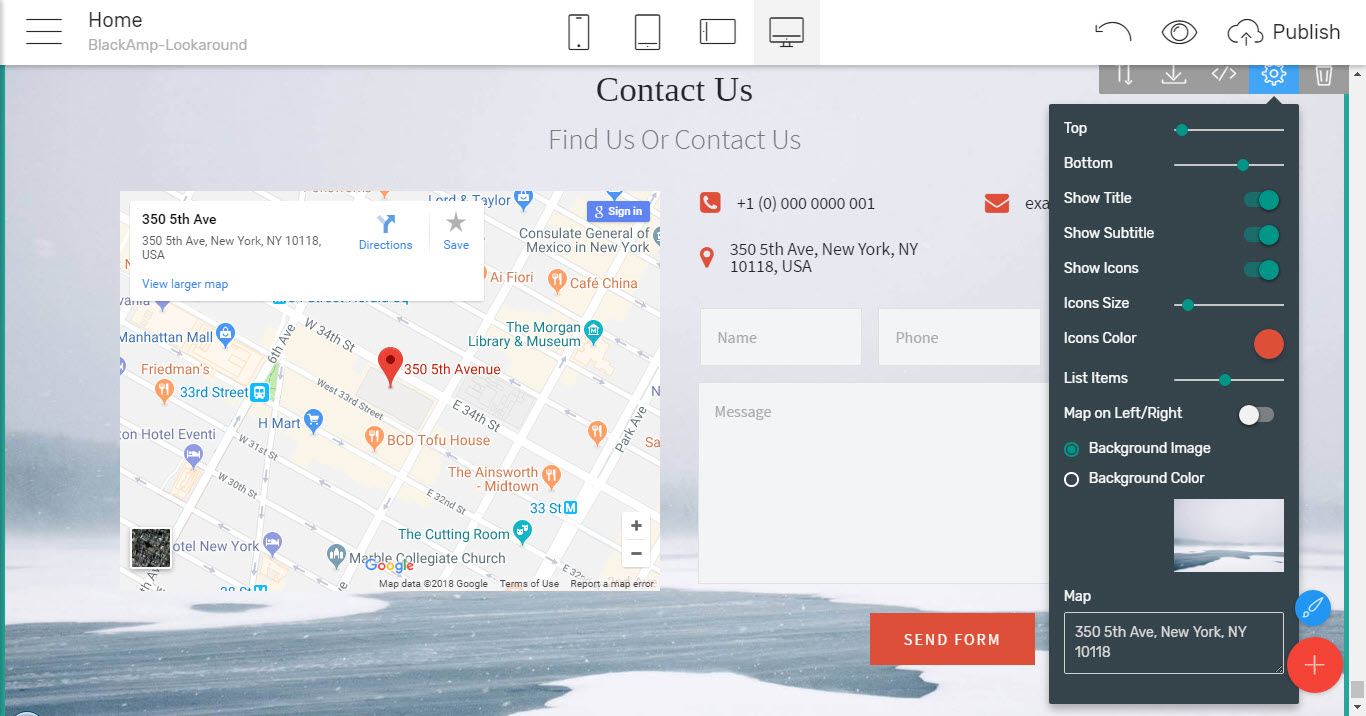
Or even get one along with any info your audience has to share – sometimes cleverly combined with another element – for example a map like over here
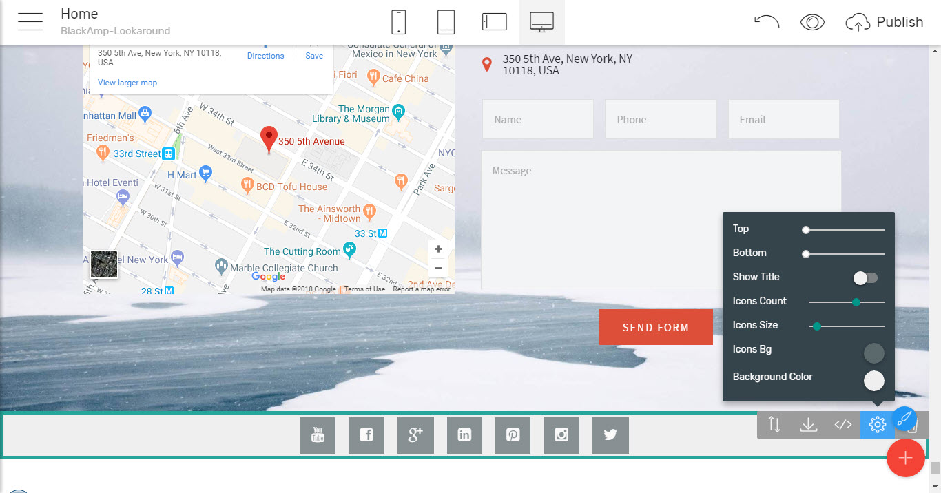
Where you can see how all the contacts details a visitor might ever need are cleverly and beautifully summarized in a single block and of course – as always – the ones you don't need can be easily turned off.
Now here comes the time to mention something interesting which could eventually be bothering the novice users – the forms. Generally, in order a web form to work properly and send its submissions, it requires some coding skills for at least setting up the proper servers and ports of your hosting which for someone just starting up might be a bit confusing and even frightening. This feature has ingeniously ben taken care of by the Mobirise Builder in the Black AMP simple HTML theme as well in all the rest pretty much from the start of the Mobirise Project- you see, there is a form handling solution built in, so in case you don’t have much knowledge in code or just in a hurry all that's needed to enter the email address you need the form submissions forwarded to and after a one step verification process the very first time a form with this email is submitted you or your clients will just keep getting an email each time someone fills up a form – on any page and in any next project you create – as long as the same email remains in the corresponding settings field.
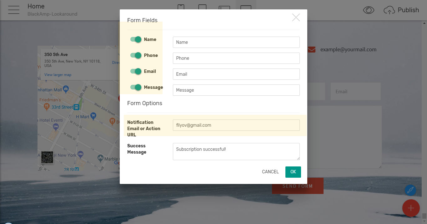
And as can be seen in the image above – you can easily choose the fields to be taking place there as well as the success message the visitor gets once the form has been completed. This is an out of the box working solutions but in case you're a developer and prefer something you've been using for a while – just place the link to the location where you've placed your favorite form handler instead of the email and it will work out nicely as well.
And since
It's a social networks world we're living in
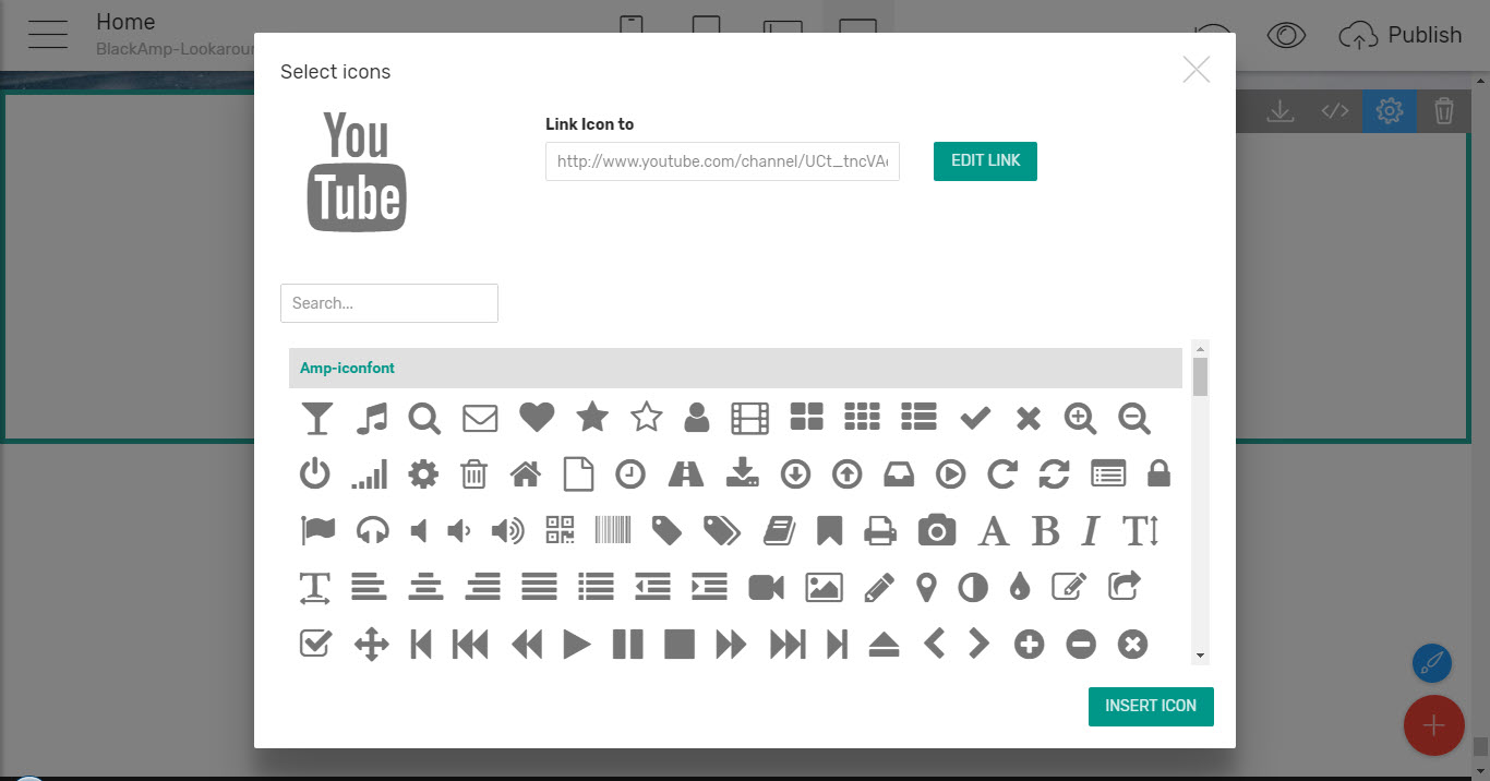
You can easily connect all the social accounts you've already put efforts and emotion creating also giving the visitor the means to easily spread the word about your page – in just a click with the follow and share blocks coming up next – just insert them and paste the links to your social network pages altering the icon if needed
Also, you can easily make the block blend with the previous/next one giving it exactly the desired appearance through the well-thought controls in the Properties Panel
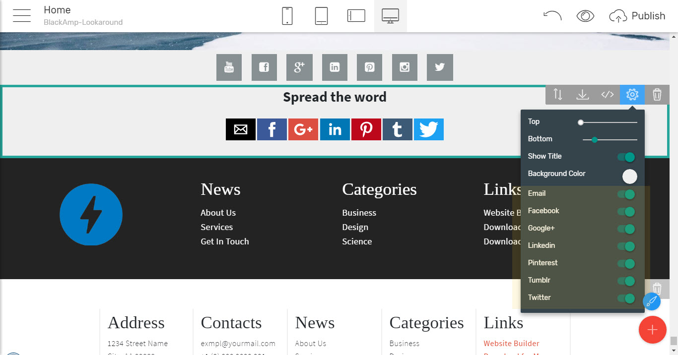
And when it comes to sharing the page – you don’t need to take care of the scripts doing it at all but just select the ways you would like your page to be shareable in – like plain email, Google+, Facebook, Pinterest and so on – by just flipping the corresponding switch, and again – making the block blend nicely or stand up according to your vision and the site's concept
And in case you don’t want to be having a separate block dedicated to that – you can easily take benefit of the
Convenient footers
Giving you the ability to summarize all the important stuff you would like to be taking place on each page, carry a copy of your site's structure or even a few more useful links and making the appearance of your page complete
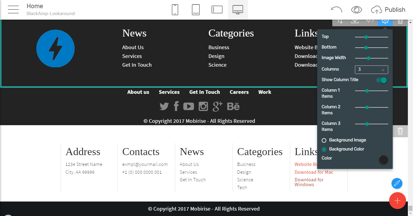
As you can see there are quite a few of those available and each one comes to be quite flexible in settings capable of serving quite a few purposes at once, however they can be easily combined for achieving even more appealing appearances as well.
That's pretty much how you can
Easily create an appealing, interesting and functional AMP page with the Black AMP simple HTML theme
without even having to know the code – by just dragging the ingeniously preset blocks, placing them where you think they belong, pour in your precious content and adjust the flexible and easy to get options for each one.
And the best thing is you're not just creating web pages following the strict AMP validation rules but they actually look good!
Is it good for me and should I strike through the Bootstrap 4 themes using only AMP?
Yes and NO!
The Black AMP simple HTML theme is great for creating AMP versions of your site that are actually looking really good and do have pretty much all that's needed for a fast load on mobiles that actually looks good. However let's not forget what the AMP standard itself was initially designed for – speed on small and limited in power/ bandwidth devices – that's exactly what it should be used for.
The pages created with the Black AMP simple HTML website template will no doubt provide up to date and appealing appearance on desktops as well but with AMP being limited in functionality by nature things are getting a bit more complicated since what could bother the small device and actually not even seen on small screens could be sometimes missed on large ones – like appealing image backgrounds, subtle visual effects, hover colors and animations and generally – all the goodies making the rich user experience once the page gets loaded on a regular computer.
So AMP should be used wisely – the Black AMP pages will display beautifully on Desktop but the only design style they could ever take is minimal. That's why even the Google guys who created AMP are advising you should be having a regular i as they call it - canonical and AMP page – taking place along, AMPs separated in a folder or a subdomain being linked with each other by just a simple line of code. This way the proper page gets fetched to the user according to the device used for accessing it.
What the Black AMP simple HTML website template does with AMP is pretty much pushing it up to the limit squeezing all that can possibly be used with the means the Standard provides but that's pretty much it. You can use it as a standalone solution but you'll have to make the compromise not having all the cool stuff that could eventually bother a mobile on the desktops and laptops coming to visit your page, which is so far still the majority of devices used for accessing the net. So to get the thins really covered up you will need the help of the great Bootstrap 4 framework as well which is, in turn, a full-blooded web design framework coming to be used with no restrictions and limitations still aiming to be displayed beautifully on any device – no matter big or small. And it loads quite fast on mobiles as well since it was specially designed for the purpose a web page to be appearing beautifully on any screen.
For full-blooded web page solutions the Mobirise Builder provides a variety of Bootstrap 4 powered themes, totally mobile friendly and full of pretty much anything so-called think of – these are the so-called M4 themes. Probably the best thing about them is they can be used for creating anything but typically come serving a specific purpose – like a showcasing a creative agency, a restaurant or a hotel. You can even create an appealing online store with M4 and Mobirise and handle it easily for free without any knowledge of code!
So each tool should be used wisely and to its purpose – what one can give you the other can't but once AMP and Bootstrap 4 get together the combination in unbeatable. As we discovered here with the Mobirise Builder anyone could easily create both AMP and Bootstrap 4 powered pages so now you have the means, but no one can give you a ready-made solution how to make them work best for you, but just some hints. The really important work you have to do on your own figuring out your site's structure and concept along with composing the right content to be taking place in it. Once you do that – just let the Builder do the heavy lifting.
The good thing is you're not alone on this one. With the Mobirise Builder getting more powerful and flexible with each new version a strong and helpful Community gets gathered around it. So in case, you happen to have any doubts on how to implement something best you can just ask around and pretty soon there will be someone to answer. This gets so addictive so before you know it you'll be sharing some experience, getting inspiration form the showcased websites, sharing your own and giving the newcomers some advice as well!
So don’t hesitate and come join the Community!
Happy designing!
